When we’re covering misinformation, it can be important to feature visuals.
Visual examples of misinformation — screenshots of posts from social media, for example — can provide evidence for our claims, and make our stories more engaging, memorable and informative.
But there’s a problem. Including images of misinformation can cause harm by amplifying it.
This means two things. First, the misinformation that you feature in a story can reproduce its messages and emotion for your readers, perhaps bringing it to more people than the original post. Given that many bad actors are seeking your coverage, this can further their aims.
Second, the image you use in your story can be copied or screengrabbed and reused in other contexts, possibly with good intentions, possibly not.
More generally, we need new tools to ensure visual media travels in secure ways that keep us safer online. Overlays are among these tools.
We explain what we mean by overlays, and how your organization could be designing and using them. If we don’t get them right, they may simply fail to work.
What we mean by overlays
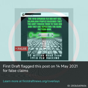
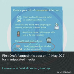
We use the term overlays to refer to a visual filter placed over an image that contains misinformation. Overlays are a tool for journalists to prevent amplification.
Applying an overlay to images of misinformation helps us provide context to readers. It prevents us further amplifying harmful content simply by reproducing the original, and stops readers from reusing it in other contexts.
Overlays can also help with two other important considerations for journalists: reducing the distress of graphic imagery and protecting individuals’ identities. This is best achieved by blurring relevant parts of the image.
Read our policy on when and why we apply overlays →
Our guidance on overlays applies solely to images used within articles. It does not apply to images for social media. Social media graphics require a different design strategy: Unlike articles, where readers have opted in and have the article to provide context, social media graphics will arrive in people’s feeds without consent or context.
Overlays are also different than labels, a term we use to refer to notices applied by platforms on social media posts. We have separate guidance for platforms on designing misinformation labels.
7 principles for designing overlays
In 2020, we researched how over 80 organizations were annotating images to warn people about misinformation. We then conducted an extensive literature review to understand the recommendations from fields as diverse as cognitive psychology and industrial warning design.
Based on this, we derived seven principles for overlays, which we have implemented in our own approach, and which other organizations can use to design theirs.
Note: we have featured examples of faulty overlays by newsrooms to help explain some of the design principles. Because the original overlays were faulty, we have had to apply our own overlays on top of them. We have included links so you can view the original overlays.
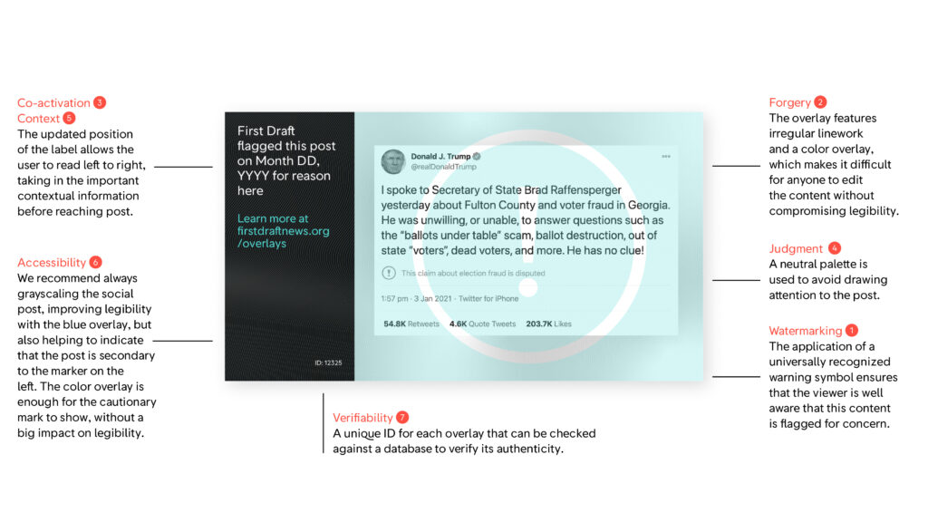
1. Watermark so the warning travels with the image
One of the behaviors we guard against is what we call “malicious cropping” — where individuals copy or crop the image of misinformation in your story and use it elsewhere.
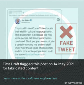
Example of an overlay that does not cover the whole image. Image: The Washington Post. Additional overlay applied by First Draft
We’ve seen that in some cases the overlays fail to prevent this because they do not cover the whole image. Someone can easily crop out the misinformation without any encroachment of the overlay.
Example of an overlay that does not cover the whole image. Source: BBC. Additional overlay applied by First Draft.
We prevent this by taking inspiration from Aos Fatos’ approach, which uses watermarking akin to what you might find on stock imagery. This approach ensures that all of the misinformation is covered.
Recommendation: Find a way to watermark the entire image to prevent reuse without your annotation, and test this by seeing what the misinformation looks like when cropped.
2. Protect against forgery
A second design principle is to prevent forgery, which is critical to the integrity of your overlay. The basic principle is that the more visually simple the overlay, the easier it is for someone to modify.
One risk is flat colors, which can be cropped and edited without any visible trace. We saw an example of this with the World Health Organization’s debunk about coronavirus prevention, where a plain blue background made it very easy to superimpose a new piece of text. Even minor forgeries like these can undermine brands’ integrity.
Example of a forged debunk by WHO, which was made possible because of a plain-colored background. Source: Reddit. Additional overlay applied by First Draft
Intricacy, such as patterns, texture or gradients, will make crops end edits more visible to the eye.
A second tactic is finding ways to add bespoke illustrations and marks that are not accessible to would-be forgers, rather than generic iconography such as “false” stamps.
Recommendation: Avoid flat colors and plain backgrounds, and introduce intricacy (patterns, texture or gradients) to make edits visible, while avoiding widely accessible items such as generic illustrations.
3. Make sure the warning is noticeable
Overlays should warn the user that the image they are looking at is misinformed or manipulated.
To do this, it’s important that the warning is activated as the person takes in the meaning and effect of the misinformation, rather than afterward. In psychology this is known as “co-activation.”[1]
This means that the warning should be obvious at first glance and be able to compete with the informational and emotional content of the misinformation. One tactic is to direct the reader’s attention toward the warning by placing it on the left side (or the right side for right-to-left languages), and decentering the misinformation. Another is highly visible warning icons.
As well as increasing emphasis on the warning, it may be helpful to reduce the emotional intensity of the misinformation by grayscaling or blurring elements.
Recommendation: Ensure your warning is visible at a glance, and ideally prior to exposure to the misinformation through appropriate emphasis.
4. Avoid judgmental tone
Our goal with overlays is not to debunk misinformation or shame posters. We therefore aim to avoid presenting an overtly judgmental tone, especially as our readers themselves might have believed or shared the image.
For this reason, we avoid the color red and crosses. Instead, we opted for exclamation marks and a neutral color. We believe this achieves a balance between activating the warning and avoiding a judgmental tone.
Recommendation: Consider whether you need to make a judgment about the misinformation, and whether your design can adequately convey that judgment when shared out of context; otherwise, opt for caution rather than conclusion.
5. Provide context — about the misinformation and the overlay
One of the key reasons for overlays is to prevent misinformation recirculating out of context. This means that some context needs to travel with the image, and therefore must be included on the overlay.
We recommend including three features: your organization’s name, the date of creation and an explanation that the overlay was added to an original image.
Newsrooms can also consider adding a short explanation of why they added the overlay, for example, “misleading claims.” Also consider adding a URL that readers can visit to learn more about how you use overlays and why.
Recommendation: Include information on who applied the overlay, when it was applied, what the overlay is and a short statement about its purpose, with a link to more information.
6. Make sure it meets accessibility standards
Each of the above principles must be assessed for accessibility. We aim to meet AA contrast standards with each image.
Often this will require trade-offs with other design principles; for example, sacrificing the potency of the design’s security by reducing intricacy. What’s more, the misinformation itself may fail to meet accessibility standards.
But it is critical that we design for everyone when we can, including those who might find overlays difficult to read; globally, 2.2 billion people live with vision impairment.
Recommendation: Assess your overlay for color contrast, legibility and readability and make the necessary adjustments.
7. Provide a way for people to verify the overlay
To protect your overlays’ — and your brand’s — integrity, anyone should be able to verify if an overlay was created by you.
From a technical perspective, publishers can explore cryptographic options that can ensure the integrity of the overlays; for example, in the form of hashes or fingerprints. Alternatively, a searchable database of your overlays could allow anyone to check that you produced it.
Finally, it’s advisable that the channels through which the integrity of an overlay is verified use stable mechanisms of storage in order to survive changes of domain names and server configurations and availability. For example, a specific publisher’s website can be blocked in some countries, or the organization can simply cease to exist. For that, decentralized systems that can retain the capacity to verify an overlay over time, under conditions of censorship and critical infrastructure failure and/or blockage, are also advisable.
Recommendation: From a design perspective, overlays should state a URL where this information can be checked; for example, a link for the article where it was originally posted or a database where readers can query for this information.
First Draft’s design
This guidance and design work was developed by a working group including Claire Wardle, Guy Grimshaw, Pedro Noel, Tommy Shane, and Victoria Kwan. This article was written by Tommy Shane with contributions from the working group. Many thanks to Claire Leibowicz and Emily Saltz for their input on the design.
Citations
- Swire, Briony, and Ullrich KH Ecker. “Misinformation and its correction: Cognitive mechanisms and recommendations for mass communication.” Misinformation and mass audiences (2018): 195–211.