By Chris Blow
Careful design can help make public-interest research projects more effective on social media. Usability, legibility and readability are essential aspects of verification. But specific design guidelines seem under-discussed in the academic and industry literature. For new types of verification projects designed for sharing on social media, the visuals of verification are especially important.
News graphics have special requirements when fact-checking and debunking. A few templates currently exist for newsrooms and independent organizations starting new types of web-based verification and research projects, but many opportunities remain to be explored. Here are a few.
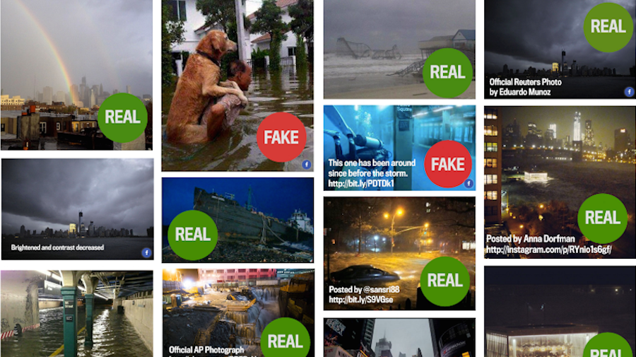
Three years ago this week, in October 2012, Alexis Madrigal with Megan Garber, Chris Heller and Tom Phillips created an article debunking Hurricane Sandy images, a post that was an important experiment in “real-time debunking”.
In his 2015 report, ‘Lies, Damn Lies and Viral Content‘, Craig Silverman quotes Madrigal in describing his motivation as simply, “to sort that shit out”. The result was a simple and effective visual system and design workflow for talking about viral misinformation.
Based on the success of that post and other recent success stories for both professional and independent verification projects, our community is taking lessons about how to talk about misinformation and earn good traffic for it.
The results of fact-checking are mixed. We know the process carries risks. The result on the public misinformation dynamics seems unclear. (See, for example, The Washington Post’s Michelle Amazeen’s work.)
But the opportunity for newsrooms and independent media seems big. Many projects are emerging, experimenting and looking at new methods and bigger audiences. Madrigal’s post on the Atlantic shows this type of public-interest ‘debunk collection’ can be super popular with readers — Silverman quotes Madrigal as saying it was actually his most popular post at the Atlantic.
It’s possible to get this stuff wrong, though. Misinformation is dangerous, and a poorly designed debunk can make the problem even worse. Even before we get to the design issues there are concerns about seeking permission, ethics, payment, and credit, as Eyewitness Media Hub’s Claire Wardle wrote recently.
Misinformation often degrades the public sphere by exploiting stereotypes and social fears. If verification projects present their results in a misleading format, then readers will be even more misinformed about the issue.
Considering our vulnerability to cognitive biases and the illusion of truth, the risk is that our verification efforts could muddy exactly the messages we are seeking to clarify.
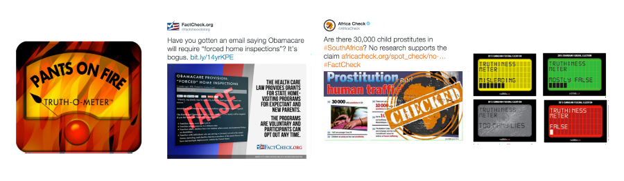
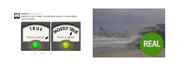
Collection of political visuals — A satisfying visual vocabulary seems to include symbols of official or impartial judgments (a polygraph, a meter, stamp, or readout) but barbed with humor. Visual meters that represent systematic fact-checking scales are used by 80 per cent of political fact-checking projects. Some systems are more consistent and usable than others. Learning about these user interfaces is needed from usability testing, academic reviews, and design efforts. (From left to right: PolitiFact, Factcheck.org, Africacheck, Rabble.ca)
Practitioners of various styles of truth-oriented information campaigns can learn from each other. According to the Duke Reporters’ Lab there are now 89 officially recognized organizations around the world checking political claims. These official fact-checking projects can be considered a core of the verification practice. Fact-checking like this has the advantage of being researched by academics — for example Nyhan’s research shows the importance of such projects as a deterrent to political misinformation and that exposure to fact-checks helps people become better informed.
But what specifically makes such visuals work? What makes them fail? So far there is too little investigation. But we can start to formulate heuristics. With a mind toward user experience and usability, we can ask better questions to advance the state of visual debunks: Why does Politifact’s “pants on fire” joke work? Why is the diagonal stamp format so popular? What font is best? What aspect ratio to use?
Considering the importance of fact-checking in public discourse, it makes sense that the usability aspects of such outputs should be taken seriously. They are a key point of contact between fact-checking efforts and readership. And on social media, where visual content often resonates with users, fact-checking needs to take both a visual and verbal form.
Amazeen confirmed that most readers like visual rating scales in fact-checking efforts, in addition to written analysis.
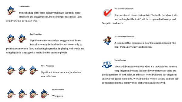
Classical verification imagery — The Pinnochio from Washington Post’s Fact Checker, which can be considered a core reference for these kinds of visual systems. A few issues come to mind: Is the meaning of an upside-down Pinnochio clear? Is it useful to distinguish between four types of false? Does the Verdict Pending symbol feel out of place in the system? For someone who can’t really remember the Pinnochio story, is a “Geppetto Checkmark” a good thing? Is red the best color for a “true” check?
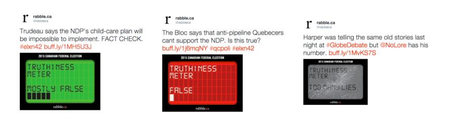
Rabble.ca’s political scale — The broken screen is a good joke. But why does it look like a pager from the 1990s? Why is the “mostly false” rating green?
Increased design scrutiny of these assets can perhaps help political fact-checking and verification projects alike develop their voice on social media; we can hopefully prove clearer, more effective more newsroom templates for generating credibility and accountability in public.
Whereas traditional fact-checking relies more on domain-specific expertise, the newer verification work is more diverse and often deals with basic questions about the provenance of eyewitness media.
Two genres of verification visuals: political fact-checking efforts like PolitiFact (left) have long used a durable system for checking on-the-record claims of politicians (at least since 2003). Newer verification efforts that deal with eyewitness images often use a ‘stamp’ and ‘stop light’ imagery (right) to visually express judgements. These are closely related interface patterns.
In addition to a core of ‘traditional’ political fact-checkers, new types of semi-public social verification projects like Bellingcat show that public-interest campaigns can drive engagement and sometimes break huge stories. (Disclosure: I work on Bellingcat’s Checkdesk, a micro-site that lives alongside the Bellingcat.com CMS. It’s a safe space for crowdsourced research.)
Amazeen notes that the “journalistic enterprise of fact-checking is spreading beyond politics. Fact-checkers are now evaluating science-based claims and consumer product and service claims.”
First Draft is especially curious about these new channels, which supplement the professional fact-checking elite. For one example of this type of project in the context of politically sensitive, collaborative journalism on a global scale, see our post from last month: How community verification and transparency can drive powerful engagement.
Indeed, independent verification and investigation projects are evolving rapidly in ways that have not yet been systematically studied compared to the traditional fact-checkers. Many workflows are now being refined by practitioners and are overdue for closer focus on the design choices that make them work well in a networked environment.
A proliferation of verification activity in the last two years is leading to some design innovations which are particularly evident in social media. These practitioners operate in public for all kinds of reasons; regardless of their motivations it is important to observe them closely and learn from their innovations.
Because there are not yet many clear visual guidelines from debunkers, we suggest that new verification projects generally should look to fact-checking efforts for guidelines on how to debunk material successfully in the public interest.
Verification advice for TV journalists— A bit dated, but a PDF of advice from FlackCheck.org has great points about how to avoid ambiguity
The principles and idioms of traditional fact-checking can serve as foundations for more adventurous new types of information campaigns. Some of the political fact-checking visual systems like the PolitiFact Truth-O-Meter™, seem especially resonant with readers on a global scale; they should be emulated and taken further by new experiments.
We can find plenty of TV discussion of debunks which hasn’t followed the TV fact-checking guidelines from FlackCheck. The Weather Channel does not follow these guidelines in their debunks of viral imagery, and the result is highly misleading without the audio, or if the visual has been detached from the audio entirely (for example, in an animated GIF).
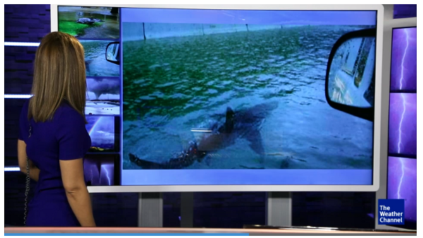
Not this shark again — The Weather Channel social media debunk segments that unfortunately don’t use the visual displacement technique or any visual disclaimer at all. It seems likely that many folks (perhaps with the audio turned down, or glancing up in an airport) might have gotten the wrong impression about this shark photo, a perennial hoax
Such visual systems can be considered as an improving and improvable interface pattern in a media criticism, something that is a known quantity with readers who may not be used to thinking in media-critical ways. Design patterns and anti-patterns identified by the fact-checking literature should be applied to newer verification projects. Nyhan, Amazeen and Silverman’s encouragement of visual systems should be taken seriously.
Lucas Graves’s research has inspired a lot of useful contemplation and opened many questions about the best practices.
As Politifact’s Bill Adair wrote in August: “Are we writing our fact-checks too long? Too short? Are we using enough data visualizations to help readers? Should we take the time to create more infographics instead of simple charts and tables? What do we need to do to give our fact-checks authority? Are links sufficient? Or should we also include quotes from experts?”
Each of Adair’s questions could launch a Ph.D, but practitioners of new verification projects have a need to figure these things out immediately. An evolving style of verification is needed because misinformation is evolving.
Let’s look at some more examples.
In some cases, more algorithmic approaches like TrooClick, LazyTruth and TruthGoggles can be developed to semi-automatically intervene in the flow of misinformation. This seems exciting to verification UI designers because it creates new interactive and visual possibilities. TruthTeller is an example of automated fact-checking with a flourish.
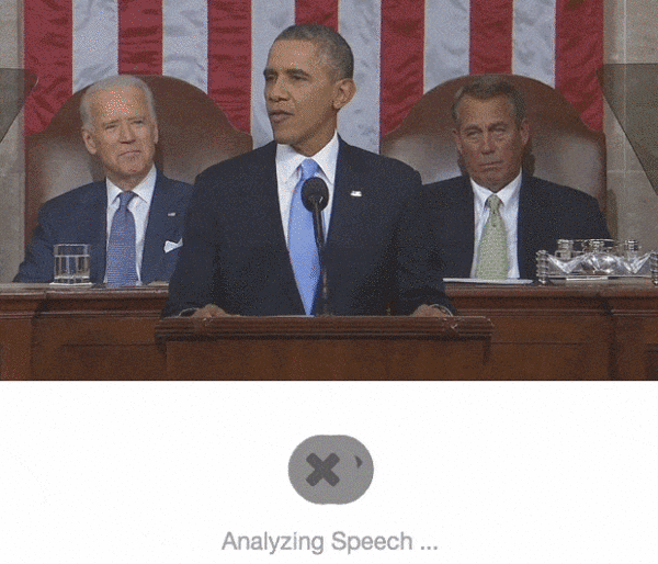
Wait for it … — Animated gif of the Washington Post TruthTeller. The “computer is thinking” animation, which is probably just added to make the computer look smart. Fair enough. But it’s confusing that it shows Obama talking but then fact-checks Harry Reid
Truth Teller uses overlays to dissect video of politicians. After a lead-in pause for “Analyzing Speech” we see a claim and clear “False” stamp. The delay helps set user expectation that the media is under scrutiny. It seems exciting, if it works.
If you want something special, one way to go is to use custom illustration and more expressive categories. The Mexican fact-checking column El Sabueso does this beautifully with an eight-part color scheme and this lovable bloodhound:
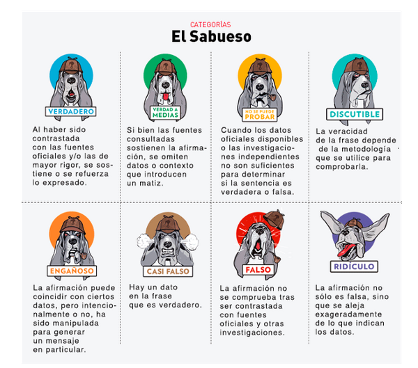
Fantastic column illustrations — by El Sabueso that bring the reader into the full process of the fact-checking workflow. This is a leading example of how fact-checking routines can be renewed. This system uses more statuses than most fact-checking routines but manages to make each verification status feel unique
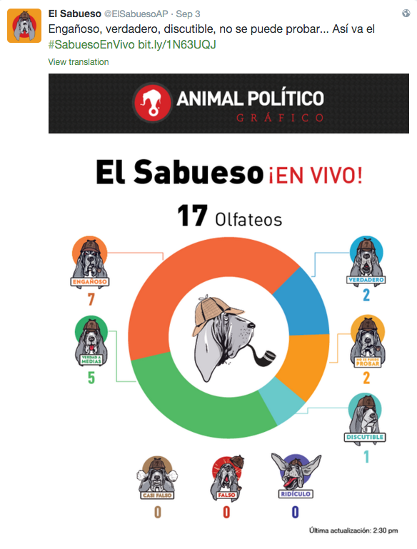
Example round-up of visual system — Using a consistent verification scale allows journalists to do recaps that review the total breakdown of judgments. Small deductions for the donut chart
¿Te perdiste los olfateos del #SabuesoEnVivo @ElSabuesoAP? http://t.co/utTi71QnCW pic.twitter.com/hcTX5jTS4K
— AnimalPolitico.com (@Pajaropolitico) September 4, 2015
A DOWNRIGHT GLAMOUROUS animated gif of a bloodhound’s ears flapping is a way to engage the public sphere in media criticism. It gets attention, carries the newsroom brand, and tells readers that this project won’t be some dreary fussiness. (There is a rendering error in the loop, but it feels charming, almost intentional).
Taking another example of creative new forms of visual verification, @PicPedant uses an inventive format of time-lapse overlays to show tweets that have been reused by several spam accounts.
.@girlposts pic.twitter.com/zGCEdC5gur — PicPedant (@PicPedant) October 21, 2015
A time-lapse is a great way to give a visceral sense that something is wrong.
And by overlaying each of the images to create an animation, the Tweet is very effectively shown to be some kind of spam. An excellent visual technique.
.@Earth_Pics Plane window photoshopped over already-oversaturated aerial photo. Also planes can’t fly to the moon. pic.twitter.com/qDp8qtPjHp
— PicPedant (@PicPedant) October 21, 2015
Again, by fading between the hoax and original photo, the manipulation becomes clear. But clearer over-labeling or side-by-side placement would be useful, like some kind of stamp.
But perhaps this is going too far. In some cases for entertainment it might be appropriate to recirculate photos that have been filtered for artistic purposes.
Does every Instagram filter need to be spelled out? Every focal-depth and film type? PicPedant is benefitting from the manipulation by debunking it and does not credit the author — would your editor let you publish this kind of piece in your newsroom? We can leave that as an open question — the purpose of this article is not to suggest exactly how to treat your questionable images, but rather to explore what your options are.
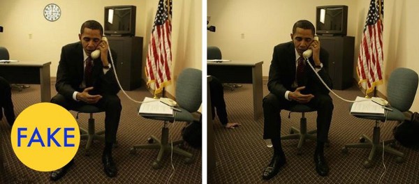
In the Hurricane Sandy story, the design execution was effective because it puts that classic stamp on top of the faked images. To improve handling of sensitive media, consider the simplest stamp like this. It can be created in many kinds of image software. Simple as it is, this works well, especially when combined with the side-by-side technique.
A Madrigal-style verification stamp at its simplest. (Shown here in San Francisco Display Medium on torch red.)
A side-by-side comparison of fake and real imagery as composed by Matt Novak on Factually, using a Madrigal-style stamp of disapproval. The addition of side-by-side comparisons in a way that entertains and clearly debunks. It’s a great example of making value from the worst parts of the internet; it helps us think more critically about the visual culture around us. Navy Futura on Gold
The stamp technique is surprisingly simple and strongly in the public interest, incorporating meme-style image text directly into the meme image. A stamp can be applied directly to imagery — a destructive change that permanently flags the imagery as fake.
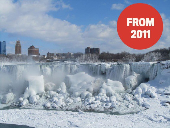
Example of how the Atlantic.com continues to do weather debunks with the stamp strategy
It’s not an archival technique for preserving something; it’s defensive publishing that creates a totally new asset with the warnings built, in so anyone who takes a screenshot and shares it will inherit that stamp. It’s smart.
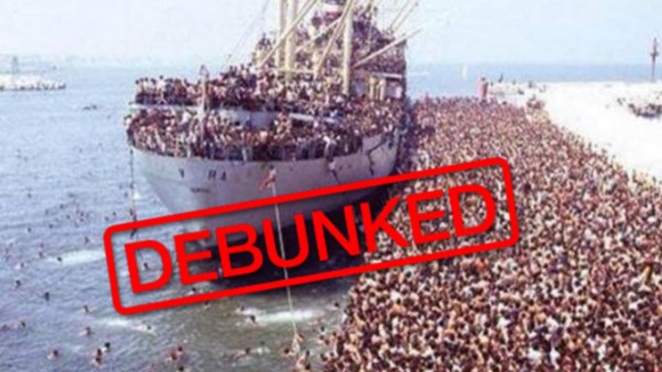
France24 uses a debunk stamp effectively. Vice, the Huffington Post and the BBC also used debunking recently in support of refugees — unfortunately they often recirculate hoax imagery without any modification or visual “hedging”
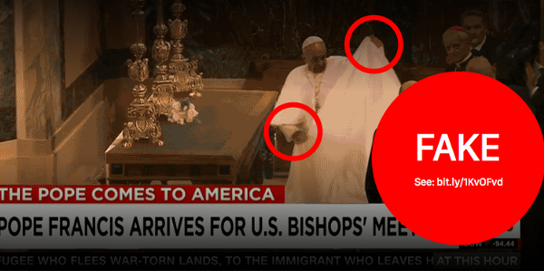
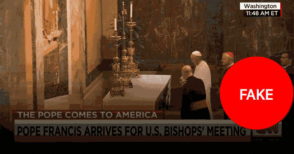
Consider the recent fake video of the Pope doing a table cloth trick which was originally on the Ellen Show. When a talk show does jokes like this, it seems harmless enough. But what happens when realistic fake videos like these can be produced in less than a day? How will journalists manage this new type of social media which manipulates reality so directly? What responses are journalists using as hoax hypermedia becomes hyper-realistic?
Matt Novak’s coverage of this hoax on Gizmodo’s Factually project explained the story with a side-by-side comparison of the unedited video with the edited video. A side-by-side view is a great way to present this type of fake. It contains the manipulation and immediately provokes media-critical dialogue about it.
If there is any possibility of a fake being misunderstood, even further manipulation of the image seems warranted on ethical grounds. Side by side is great — but darker gradient overlays can be added to help further obscure the viral imagery being debunked. This approach can help distance a reader from the immediacy of a hoax image, just as a blur is used editorially to cover violent images. The degree of cover needed to contain the confusion of a hoax is variable and ideally should be determined by an editor.
These are as simple as highway signs. They should reframe a fake and make it’s questionable status immediately obvious. They help us keep a healthy sense of incredulity.
By superimposing image text, we can help ensure that we are talking about a debunked artifact, not reality, and have a conversation about the falsification of media without merely recirculating unverified media.
For broader circulation beyond a media-critical space like this one, a static image with even greater clarity might be appropriate.
Example debunk mack-up — This example, invented for discussion purpose only, shows a static image with multiple layers of caution embedded in the image: the darkened gradients added to the top and bottom, the fake status stamp. A shortened link is integrated into the composite image text for full attribution even when the image is reposted on other networks without the context of the original verification work. Red annotations help make it viscerally clear that something is wrong with this image
The point of such editing is to layer on warnings that make it safer to talk about the video. With GIF software we can also adjust the framerate to make the hoax less realistic. Silverman refers to this as hedging. Media ethicists will disagree about what degree of hedging makes it safe to talk about the video in which contexts, but it’s worth considering.
Example animated — An animated example of obscuring parts of the image in an effort to prevent misunderstanding during social media verification process. Further hedging might be needed for more sensitive cases — for example, the fake timestamp at the top would be good to cover

Example filmstrip — Perhaps in addition to the darkening technique and label overlay, we could use a filmstrip style to show exactly where the edit starts. Similarly, Flackcheck recommends a matrix and Novak uses the side-by-side
We could go on, adding more overlays to the video, covering, filtering and hedging until we are certain it’s safe to recirculate for discussion. The final result should be measured by how resilient it is — the question is, how much does this design asset resist misunderstanding, while still facilitating discussion about the hoax?
The purpose here is not to find the perfect aesthetic, but rather to make the point that we have defensive design techniques at our disposal. The final result would probably involve a combination of several techniques, in conversation with an editor.
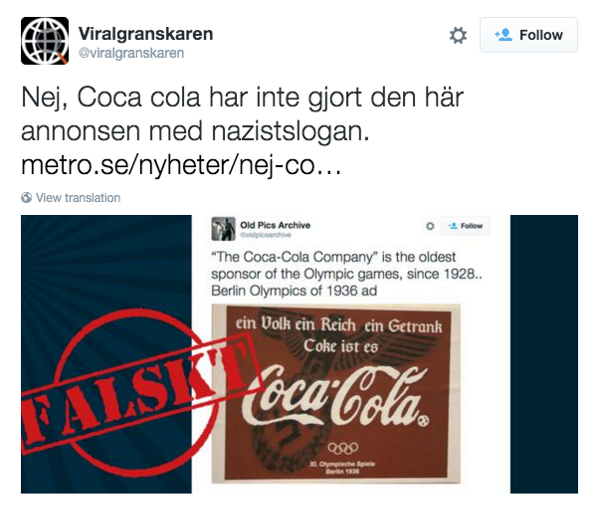
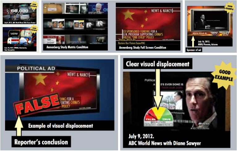
Classic stamp — Screenshot and stamp are a good example of displacement
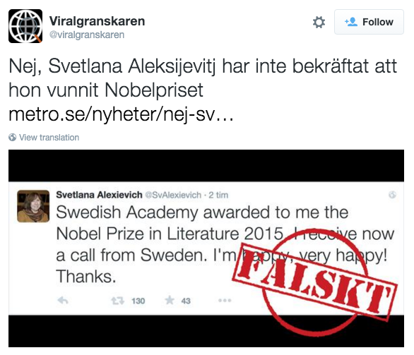
Falskt! — Good example of displacement. The original is still readable but the judgment is clear
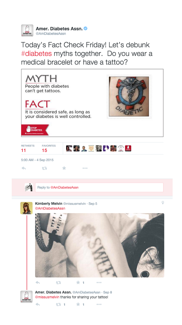
Excellent myth-checking — The American Diabetes Association shows skillful participatory debunking — using the 2:1 ratio, clearly stating an unattributed claim, clearly stating the fact, and asking for “eyewitness” reader input
Here are some lessons taken from selected examples of debunk visuals that pose usability problems and could potentially misinform readers on social media:
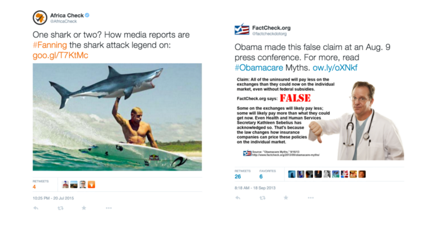
Africa Check and Factcheck.org using arguably too much humor and stock imagery
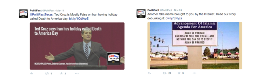
Left: The debunk label “MOSTLY FALSE” is too small and seems contradicted by “Politifact Texas” logo which point to the true side of the Truth-O-Meter. Right: the Photoshopped image was re-shared without composite text in the image — that means the image appears without a debunk headline in media collection views that don’t show Tweet text
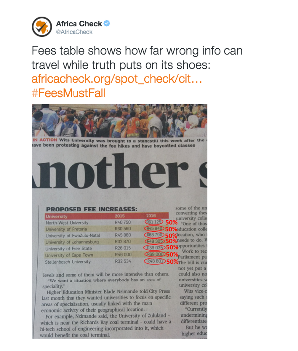
Mixed results — The annotation of print news is a great pattern. But these particular annotations aren’t very legible or immediately understandable. The image also has that aspect ratio ratio problem — it should be a 2:1 ratio, ideally
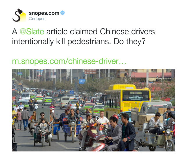
You won’t believe what happened next — Snopes has perhaps taken their game a bit too far. This kind of clickbaity ‘curiosity gap’ headline-writing technique is inappropriate for debunks, especially when they concern myths about sociocultural stereotypes. The unattributed image doesn’t add much information
As an industry we’re just getting started here, and all of the above-mentioned organisations are leading the way in terms of debunking hoax stories or misrepresented facts. Debunking activity is not limited to professional journalists and debunk visuals don’t have to come at the end of the process. What might debunk visuals look like that try to actually recruit reader input?
For discussion, below are a couple of concepts from our Checkdesk project that incorporate the displacement technique with warning emoji. What do you think?
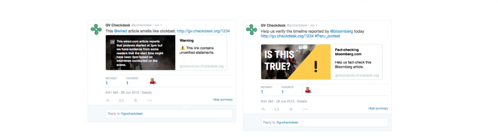
Some design concepts from the team at @meedan for the Checkdesk project. Left: uses the Unicode “warning sign” ⚠ . Right: takes the warning concept further to cover the photo with the warning sign. We’re interested in gathering feedback about how to do better visuals for new types of verification projects
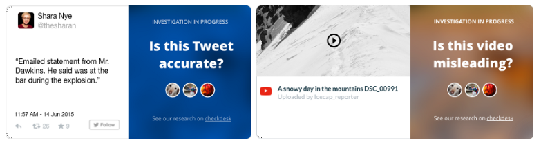
More example designs from Checkdesk design sessions. These were intended as cards that would live on a blog. Based on the logic above, they were scrapped because they don’t go far enough to “hedge” the content of the videos — instead of using the direct overlay technique, these have a bold question that lives in a second column. They probably should use the composite image text technique
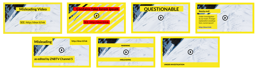
Still more examples, rougher explorations of ‘visual hedging’. Created as a design exercise by the @meedan team for a Checkdesk design sprint
If you are engaging in fact-checking, how should you actually present your results?
As Madrigal, Graves, Amazeen, Nyhan, Novak and others have shown, responsible verification projects can be very popular with readers.
“The debunking efforts in the press are in some ways an anti-viral viral content strategy, a maneuver to insert themselves into trending content by examining and verifying viral stories. This brings traffic to debunkers, but it also helps spread the truth about a viral story,” wrote Silverman in his study.
Gawker Editor Max Read wrote, we’re “ankle-deep in smarmy bullshit and fake ‘viral’ garbage.”
If these techniques can work reliably and safely for journalists and earn traffic, it’s like finding a way to reliably convert that bullshit into fuel.
As a community of both journalistic fact-checkers and nontraditional verifiers, we’ve only starting to understand some of the usability implications of these interface and interaction designs.
This article is based on a lightning talk at ONA15. Thanks for feedback and encouragement! The original designs above, where noted, are released under the CC-BY; remixes encouraged.