With special thanks to Carlotta Dotto and Rory Smith
On January 25, questions began to emerge about how it was possible that the word “coronavirus” was on the back of Dettol bottles. The virus had allegedly only emerged in the last month, but these bottles were much older. Did Dettol know before we did? Could it kill this new deadly infection?
By January 30, this question turned into an explicit viral claim: Dettol “kills coronavirus.” The next day, The Sun ran a story declaring, “Shoppers amazed that Dettol kills deadly coronavirus.”

The infodemic is an abstract concept. But one way to conceptualize it is in terms of demand and supply. During a pandemic, the demands for credible information change over time. At first, we see a demand for information about its origin; then, medical treatments; later, public policy. As these needs emerge, the question of supply becomes critical: Can supply meet the demand for accurate, clear, credible information?
In the case of the Dettol bottles, the demand for information arose around January 25. It wasn’t supplied until AfricaCheck fact checked the claim on February 4, and then when Full Fact did the same on February 17. Before these interventions, the questions were left unanswered. The supply of credible information did not meet the demand, and there was a dangerous deficit.
There is always a delay between the demand for information and its supply, and so data deficits, as we are calling them, can never be eliminated altogether. The challenge for information providers – reporters, fact checkers, governments, health bodies – is to find them, prioritise them, and act.
Can we identify data deficits in real time? Can we predict them? What signals would we use?
To put the concept of data deficits into action, and to explore the methodological and technical opportunities for monitoring them, we ran a fast-paced sprint with GATE at the University of Sheffield. The result was a prototype dashboard designed to take a first step towards this goal. It was built to do three things:
- Develop the concept of “data deficits,” building on Data & Society’s concept of “data voids” and Google’s “content gaps”
- Identify and track signals for the demand and supply of credible information: Google search interest and Wikipedia page views as signals of demand, and fact checks as signals of supply
- Provide an overview of the ratio between these indicators during the first six months of the pandemic
In this report, we explain more about how we approached the concept of data deficits and the dashboard, what we need from platforms to take this further, and what we plan to do next.
Gaps, voids and deficits
During a crisis, we engage in a process called “collective sensemaking,” where we work together to understand what is happening and what to do. Trying to understand why Dettol knew about coronavirus before the pandemic, and if it’s a cure, is a typical example. Because we so often search for answers online, a lack of credible information from search engines can lead desperate people to life-threatening actions.
This kind of vulnerability has come under increasing scrutiny.
A similar phenomenon has been investigated by Michael Golebiewski and danah boyd in their report on data voids for Data & Society, which focused on situations where few or no search results exist for certain search terms, which can then be exploited by bad actors. More recently, Google has also turned its attention to a similar issue, building Question Hub, a tool designed to identify “content gaps,” situations “where content just isn’t there,” and is working with fact checkers to fill them.
Here we introduce a new concept, data deficits, to examine a similar, search-related vulnerability: situations where there are high levels of demand for information about a topic, but credible information is in low supply. Low supply may occur because credible information doesn’t exist or because it isn’t reaching people.
Rather than a void or gap, high demand and low supply create a deficit: a lack of credible information, where results exist but they are misleading, confusing, false or otherwise harmful. They are the result of a mismanaged information supply chain, not a malicious actor.
The demand and supply of credible information
The reason for conceptualizing the infodemic in terms of supply and demand is that it creates a framework for identifying relevant signals. If we can bring together signals for what information people are looking for right now with signals for what information is currently in supply, then we can begin to identify where deficits are emerging. To do this, we explored a range of signals for both sides.
Demand
For demand, we consulted two indicators of interest. The first was Google Trends, a platform that provides data on what people are searching for on the world’s most popular search engine.
The second indicator we consulted was the Wikipedia API. While it may seem counterintuitive to use Wikipedia as an indicator for information demand (or an indicator at all), the most-viewed pages on Wikipedia tell us something about what people are looking to learn about. This can provide both a warning signal and context when comparing the relative popularity with other non-infodemic related pages. And, like Google, it has immense global reach and is in many languages.
Supply
For supply, we focused on one form of credible information and the people it reached: fact checks. We looked at fact checks related to coronavirus, published in the first six months of 2020. In total, we collated 9,722 unique fact checks from three sources: members of the International Fact-Checking Network, organizations using ClaimReview, and Full Fact’s API. Because supply depends both on information’s existence and access, we also drew on traffic data from alexa.com to estimate the geographic spread of the fact checks, and the number of social interactions on the URLs, via CrowdTangle (Facebook, Instagram and Reddit) and Trendolizer as an indicator of spread within social media.
Fact checks are, of course, only one small subset of credible information; news reports, scientific papers and public health bodies’ statements are others. However, fact checkers are in a position to respond to deficits in real time, making them a relevant stakeholder. On a more practical level, the smaller number of articles (compared to all news articles related to coronavirus) left us with a more manageable dataset for this exploratory phase of a product build.
Detecting the deficits: two routes
Data deficits
To detect data deficits, we explored two routes.
The first is a numeric score. We wanted the concept to be as intuitive as possible: the ratio of search interest in coronavirus in a given country (demand) to the number of fact checks in that country (supply). If interest suddenly spiked, and relevant fact checks were in low supply, we’d know there was a problem. The numeric data deficit score, while a crude measurement, could provide the basis for alerts for further investigation.
The second route is a display of indicators for evaluation by the user. These indicators were:
- the top Google searches for each country
- the top Google searches related to coronavirus for each country
- the top Wikipedia results for each country
- the top fact checks, by number of interactions (as a proxy for exposure)
Users can compare signals of demand to signals of supply, and make their own subjective assessment of whether a deficit exists and needs addressing.
Engagement deficits
We also wanted to consider another phenomenon: deficits on social media. As we’ve written elsewhere, social media platforms are search engines as well as social networks, and yet they do not provide search trend data. Despite search not being the primary interface of these platforms, we expect that, with billions of users, a large part of our picture of deficits is missing.
However, social media can also tell us something about supply. If credible information exists, but is receiving very low engagement on social media, we can use this as a proxy for a supply deficit. Credible information must not only be created; it must also be shared.
We therefore developed a metric called “engagement deficits” — situations of high interest in a topic on search platforms, but low engagement (measured by likes, shares and comments) on social media. This would indicate that even if fact checks are needed and available, they’re not reaching people on social media.
The dashboard
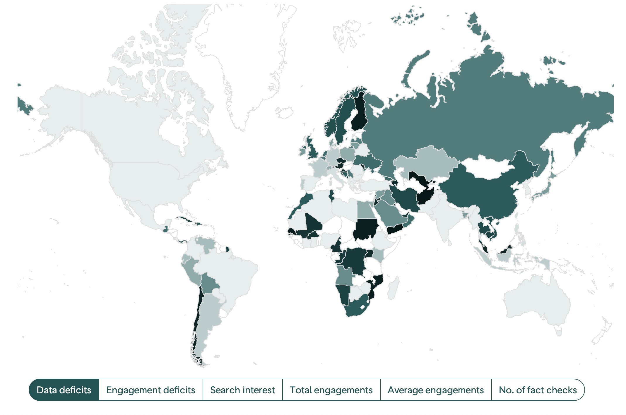 An international comparison of data deficits as of 28 September 2020; screenshot by author
We visualized these indicators in four sections, focusing on variations between and within countries. We focused on countries because this is the main site for intervention, whether that be policy, news reporting or fact checking. The dashboard includes four sections:
- an international comparison of data deficits
- a country-level analysis of information demand and supply
- an analysis of fact checks and their CrowdTangle interactions
- an international comparison of data deficits
Data collection and analysis
Google Trends
The key signal of demand we used was search interest on Google, provided by Google Trends. We used a Python script to scrape search interest in “coronavirus.”
Given that search interest is relative, we had to decide what we wanted to compare interest to in order to generate a score for each country. Reporters generally report within their own country, so we decided that it was more informative to know whether search interest in “coronavirus” in a country has fluctuated (i.e., is this high or low interest compared with what it was last week) rather than compared with other countries. We therefore decided to compare with a previous time period.
We were not able to combine keywords in a single query, so we had to select one. We could have searched for each country’s interest in its most prominent language, but this would mean variations across countries where multiple terms and languages (because of demographics) were common. We compromised by using “coronavirus” in every country as a proxy for interest, relying on the fact that if interest in coronavirus increased in a country, this would be reflected in English searches.
These graphs show a comparison between querying for “coronavirus” in English and in local languages.
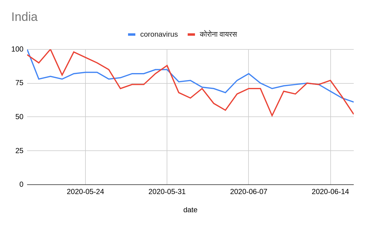
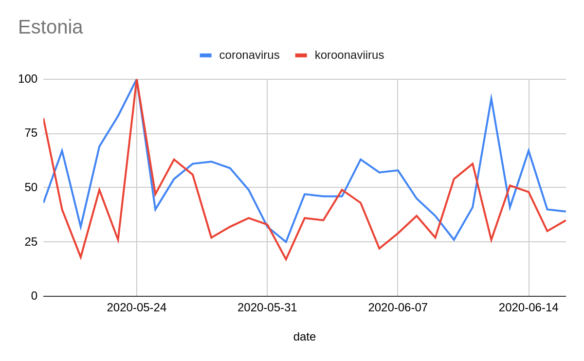
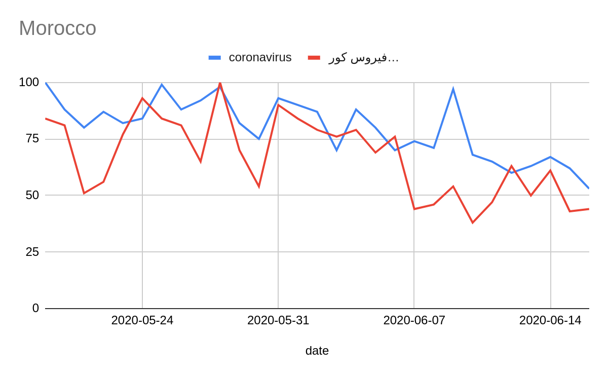
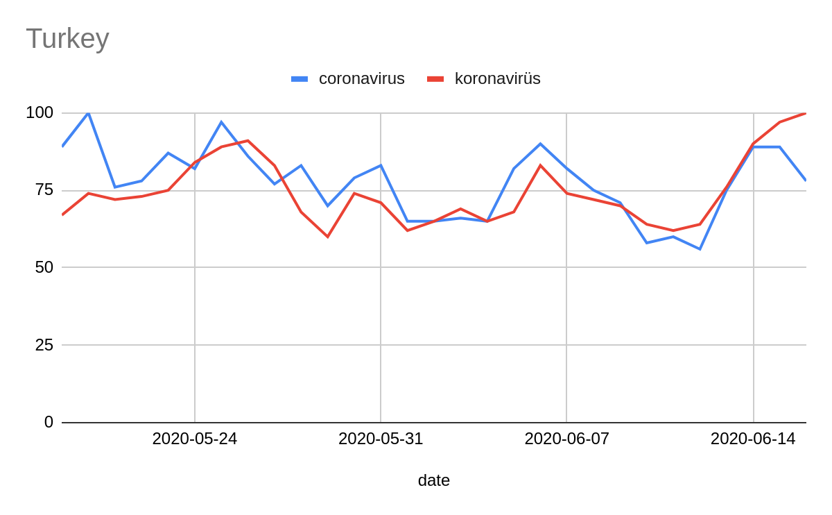
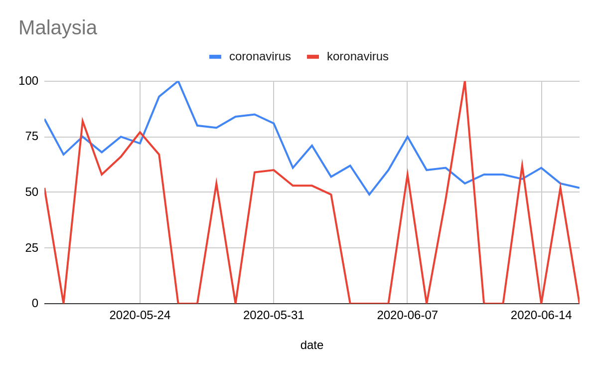
It is important to acknowledge that information about countries where Google services have been or are restricted, blocked or banned might be presented with anomalies.
Wikipedia
Wikipedia’s API provides information on page views for Wikipedia entries, helping us see what people are looking up by using the database. Given that Wikipedia is segmented by language, we identified which language was most popular in each country and featured the top articles in that language.
The limitation of Wikipedia is that it requires an existing entry to be present in the data, biasing it toward entities and issues that are already established. It will be less sensitive to new, emergent issues for which there hasn’t been sufficient time, inclination or information to write an entry.
It is important to acknowledge that Wikipedia’s API data might be presented with anomalies in countries where the service has been or is restricted, blocked or banned.
The fact checks
We gathered 11,418 debunks from three sources: members of the International Fact- Checking Network (7,787 debunks), organizations using ClaimReview (3,476 debunks), and Full Fact’s API (155 debunks).
IFCN debunks were extracted by scraping the official IFCN web portal for coronavirus-related debunks at https://www.poynter.org/ifcn-covid-19-misinformation/.
Debunks with ClaimReview meta-tags were extracted via Google Fact-checker Explorer API. We built a dataset of “coronavirus” and “covid” translated into 105 languages and queried them individually. The dataset can be found here.
Full Fact’s debunks were extracted directly from its native API.
Deduplication among the three different sources privileged IFCN data as it is more complete. It also privileged “manual” over “automatic” annotation of category. The main element for deduplication was the URL of the debunks, in order to account for the differences in the way organizations reported the claims in the three datasets.
Although rare, some organizations annotated all or multiple debunks both on the IFCN website and ClaimReview as a single or repeated URL, in general the URL of their online portal, which occasioned their debunks to be counted as just one.
Lack of accuracy in the annotation of publication date of the debunks was detected both in the IFCN web portal and ClaimReview. Because of the impossibility of manually correcting all of them, the publishing dates are presented “as they were extracted” from these sources. In most cases, we found that annotators mixed up the date of appearance of the claim they had debunked with the date the debunk itself was published. In general, these two types of dates are close to each other, thus not significantly compromising the statistics. Out of a sample of 50 randomly selected fact checks, publishing dates were wrong by two to six days in three of them, and three of them were wrong by 10 to 60 days.
The final dataset comprises 9,722 fact checks: 7,639 extracted from the IFCN web portal, 82 from Full Fact API and 2,001 from ClaimReview, from January to June 2020.
The topics
In order to break down the highest-level topic of coronavirus into more precise sub-topics, we assigned each fact check to a topic based on the Reuters Institute’s typology of coronavirus claims. We used the University of Sheffield’s machine learning classifier to assign a topic to each of the 9,722 fact checks.
At the EUvsVirus hackathon in April, 1,293 debunks were classified by human annotators. This was then used by GATE at the University of Sheffield to automatically classify the remainder of our much larger dataset of 9,722 debunks using a machine-learning model trained on the manually annotated data.
Location
To understand supply, we need to understand which countries are accessing what information. One way to do this is by the fact checker’s country of origin: If Full Fact is based in the UK, then all its debunks are attributed to the UK.
But people all over the world access Full Fact’s debunks, not just those in the UK. To understand which territories are actually accessing a given debunk, we used Alexa Web Service Information API to provide an index of the geographical spread of websites’ traffic. We used this to proportionately distribute the debunks across those countries.
So, from a website with 70 per cent of its traffic from the US, 20 per cent from the UK and 10 per cent from Canada, we added:
- 0.7 to US’s number of debunks circulation
- 0.2 to UK’s number of debunks circulation
- 0.1 to Canada’s number of debunks circulation
We applied the same method for calculating the location of interactions, using website traffic as a proxy for where the interactions come from. So, for a debunk with 1,000 interactions (calculated via CrowdTangle and Trendolizer) published by a website that has 70 per cent of its audience from the US and 30 per cent from the UK, 700 interactions should be assigned to the US and 300 interactions to the UK.
Accurate metrics could not be extracted for a small number of websites. In some cases, CrowdTangle would not differentiate between different pages of the same website; in others, Alexa would return no valid data about the traffic of a specific website.
When CrowdTangle failed, the cumulative metrics of the specific fact-checking websites were equally divided by the number of debunks coming from that website. For consistency, we identified the exact URLs in these websites returning the same metrics and only applied this method to those. A comprehensive breakdown of the websites and URLs affected can be found here.
Where the Alexa API failed, the audience of the fact checks from those websites was assigned to the publisher’s country of origin based on IFCN’s information provided in its coronavirus-related debunks portal.
Finally, the data returned by Alexa, which allowed us to have a geographic estimation of the audience of the websites publishing the fact checks analyzed, is affected by users using a proxy, a VPN or anonymity tools such as the Tor Browser.
Handling the volume of information supply
We have made a series of recommendations for platforms on how to improve their services to allow better, more precise monitoring of data deficits. We also need improvements to APIs.
In order to understand online information flow, we need access to metrics and data about services and social media platforms. This data must be detailed, easy to analyze and easy to query programmatically.
In this project, we faced challenges trying to use mostly public APIs provided by Google, CrowdTangle, Alexa and Twitter, which can be summarized as:
- Usage limits: Difficulty when querying an API endpoint programmatically because of usage limits. For example, the standard CrowdTangle API offers two queries per minute and we were dealing with 11,418 queries.
- Historical limits: Difficulty or impossibility in trying to access the history of activity on some platforms. For example, Twitter’s API only returns metrics about a specific URL based on the last seven days, which made it impossible to use in this project because we aimed to extract metrics from debunks published more than six months ago.
- Imprecise or incomplete results: Some APIs returned data that, when manually checked, proved to be inaccurate, slowing down the research process and jeopardizing part of the methodology. For example, CrowdTangle was not able to identify different URLs on a small number of websites and instead returned cumulative data for the whole site that produced the fact check; Alexa was not able to return information about the audience of a small number of websites. These issues are detailed in the section “How we calculated geographical spread” above.
If we want to create an accurate picture of the supply of credible information, we need to look beyond fact checkers to a wide range of news sources. But there will be difficulties with this given the scale and limitations of the APIs. These technical limitations must be tackled in the next phase of this work.
What’s next
We need platforms to provide more transparency over search. On Google, we need more precise queries that make full use of Boolean operators, and include the ability to use brackets: this would mean we could track combinations of multiple keywords, and so track interest in sub-topics like medical treatments, rather than coronavirus as a whole. On social media, we need platforms to confront the fact that they are search engines and start providing analytics on what people are searching for.
If we can gather this data, then we need to start tracking multiple high-risk topics — not just the coronavirus, but conspiracy theories, vaccines, elections and climate change. Targeting specific topics, and breaking them down into subtopics, can develop targeted monitoring of search for high-risk issues.
Without it, we risk being blind to major vulnerabilities.
Based on a project by Pedro Noel, Carlotta Dotto, Tommy Shane and Rory Smith from First Draft, and Kalina Bontcheva, Mark A. Greenwood, David Wilby, Adam Funk, Twin Karmakharm and Ian Roberts from GATE at the University of Sheffield
This project was powered by a COVID-19 Challenge Grant from Aspen Tech Policy Hub.
This article is part of a series tracking the infodemic of coronavirus misinformation.
Stay up to date with First Draft’s work by becoming a subscriber and following us on Facebook and Twitter.


