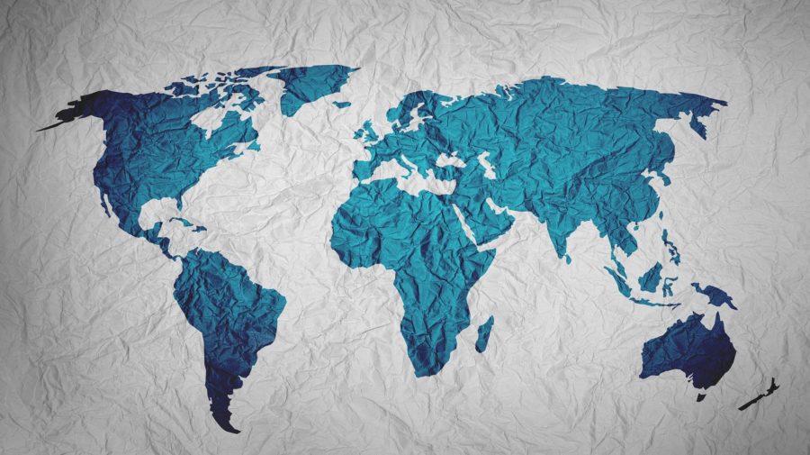
A picture may tell a thousand words, but a map can help to interpret hundreds of thousands of data points and ‘show’ a story in mere seconds. Studies have shown how the human brain is much more inclined to believe information presented visually — especially when supported by data and numbers.
So as the coronavirus spread rapidly over the last few weeks, maps were widely used to track the outbreak. The most accurate and useful charts provided real-time information of confirmed cases in China and around the world, with figures based on official data from the World Health Organisation, Centers for Disease Control, China National Health Commission and from Chinese government sources. They gave an accurate picture with accompanying methodology at a time when misinformation was spreading as quickly as the virus.
But maps themselves can be misleading, misrepresented and misinterpreted.
While social media users may be seeking reassurance, badly designed or misrepresented maps risk worsening ‘population emotions like fear, panic, anger, racism and discrimination,” said Dr Swee Kheng Khor, a global health expert at the University of Oxford.
“Public mass hysteria will prevent health services from correctly allocating resources to where the problem is worst, because decisions are captured by mob mentality,” he told First Draft.
And, Dr Khor added, maps come with great responsibility: “If you visually present accurate data in a misleading way, it’s either insincere, untruthful, outright propaganda or downright dangerous.”
In mid-February, major news organisations around the world published breathless stories about a “terrifying” map, with red lines criss-crossing and encircling the globe, lines they falsely claimed were how the the virus would spread, or how it had spread already.
Their source, they all reported, was a study from the WorldPop Project at the University of Southampton in the UK. The study, which was not peer-reviewed, estimated how many people had left Wuhan before the region was locked down. The image they initially tweeted to accompany the study, however, showed global air-traffic routes and travel for the entirety of 2011.
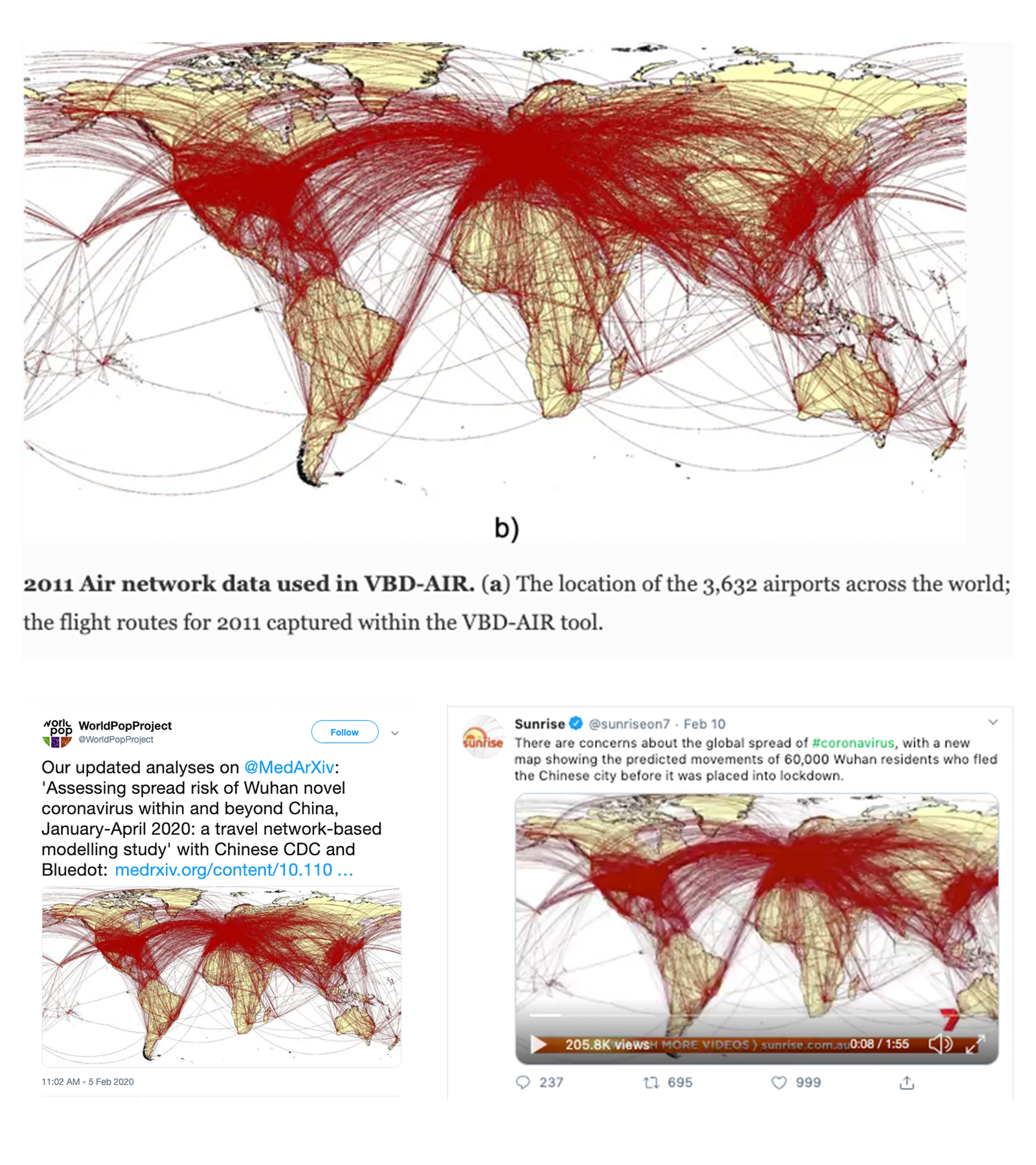
The map from a 2012 study (top, with original caption) was shared to ‘illustrate’ more recent research into the coronavirus’ potential spread in a tweet (bottom left), and then picked up by news organisations around the world (bottom right). Screenshots by author.
The tweet was hastily deleted and the study reshared without the old image, but not before being misinterpreted and republished by tabloids and television producers around the world, apparently without any semblance of fact checking.
The project’s account responded to concerns raised on Twitter by describing the image as “intended to be an illustrative picture of the global air network”. A spokesperson for the university told First Draft WorldPop’s work is helping to inform WHO efforts to track and control the disease.
This was just one of dozens of cases contributing to panic and anti-Asian racism as a result of the coronavirus, but it wasn’t the only story which was subject to misinformation in the first weeks of 2020.
At the height of Australia’s extreme bushfire season, celebrity Rihanna tweeted a highly misleading picture of the country to her 96 million followers. The 3D art was made using hotspot data from 31 days of fires, according to the artist who created it, but it was mistaken for a satellite photograph.
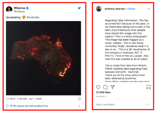
The artist (r) pleaded with social media users not to share his work as accurate. Celebrity Rihanna (l) shared it with her 96 millions followers. Screenshots by author.
The graphic demonstrated how easily data visualisation can mislead or be misunderstood, and was one of several misleading images which went massively viral across social media without portraying the truth.
While many defended the maps as serving a larger purpose to bring public awareness, others declared some maps were being used to wreak havoc and spread unhelpful viral misinformation.
“The artistic representation of the fires [shared by Rihanna and others] was never intended to be an accurate representation of data,” said Alberto Cairo, the Knight Chair at the University of Miami and and author of the book “How Charts Lie”.
“But it is very hard for a creator of visualization to control how their products are going to be used, to be interpreted or misinterpreted.”
Everyone is now able to create information – and, potentially, misinformation – online. So how much should ordinary citizens reflect on their responsibility for what they shared? And the possible consequences when information is misrepresented?
“Part of the problem with the map, it is not the map itself. It is the misinterpretation of these maps, due to the fact that people don’t pay attention, to where it comes from, who generated it, why he generated it. What data they used. And so on,” Mr Cairo told First Draft.
The artist issued his own plea for people to stop sharing it on social media and said he “didn’t realise this would go viral” but the damage was already done.
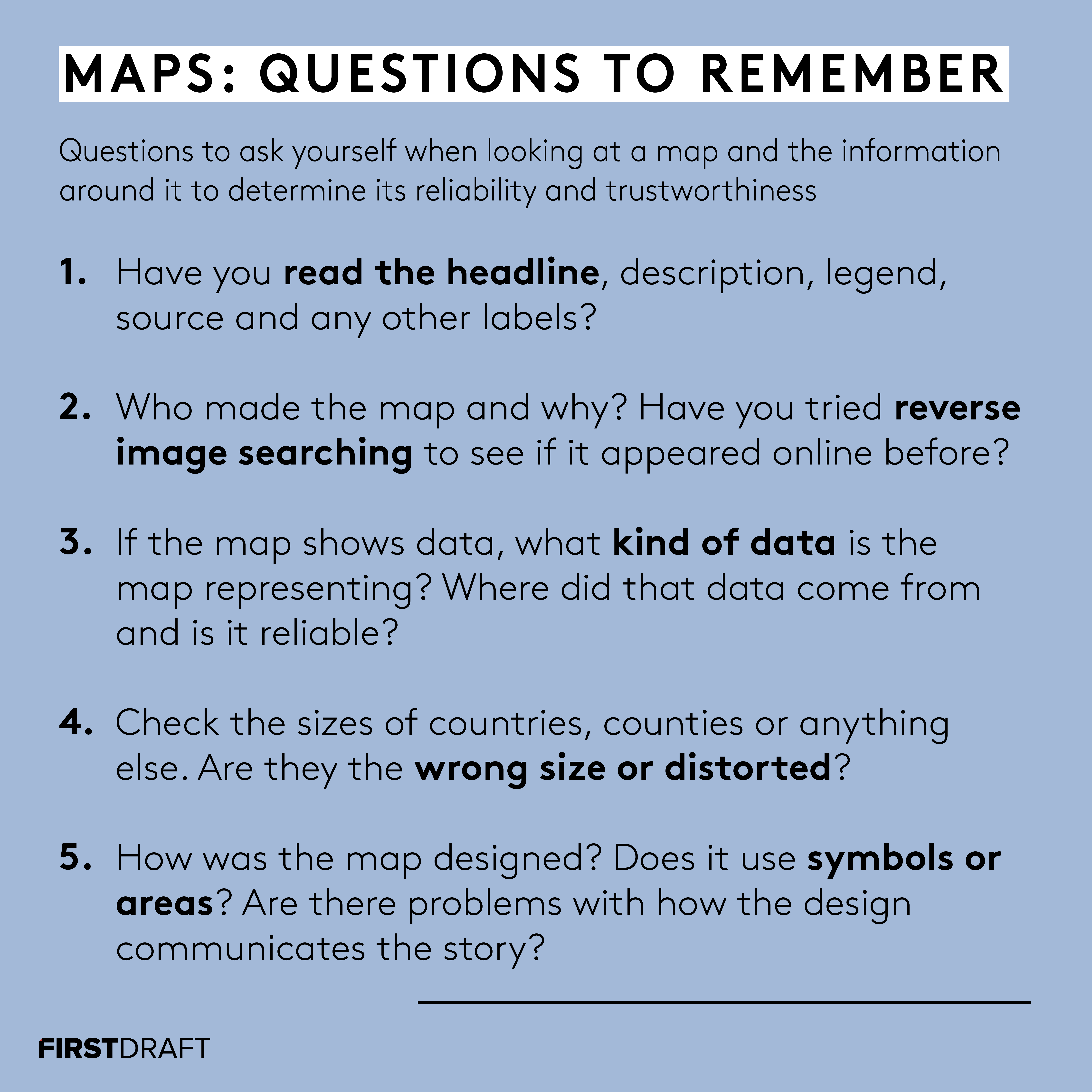
There are some crucial questions and considerations which anyone can apply when they see a map shared online. Lydia Morrish/First Draft.
The famous book ‘How To Lie With Maps’ by Mark Monmonier said explicitly that: All maps lie. Cartographers have always been presented with the same impossible dilemma of projecting a three-dimensional object (the earth) onto a two-dimensional surface. The results are always distortions of the truth, ”an imperfect model of reality,” according to Cairo.
“Not necessarily as a conscious effort to mislead you, but maps are never reality itself. Sometimes people forget about this.”
“We will always have ‘better or worse’ maps, but never ‘true’, and we should avoid binary thinking as much as possible, thinking more in terms of the spectrum of reality: Is this map better or worse in representing the phenomenon that it is intended to represent?” he added.
The “better” maps, as Alberto Cairo described them, often rely on complex mathematical equations. One of the most famous examples, The Mercator projection — created in 1569 and still widely-used today by almost all online map providers including Google Maps — distorts land masses depending on their position relative to the equator.
The Gall-Peter projection, by contrast, gives a more accurate representation of the relative size of different regions of the earth but distorts their shape.
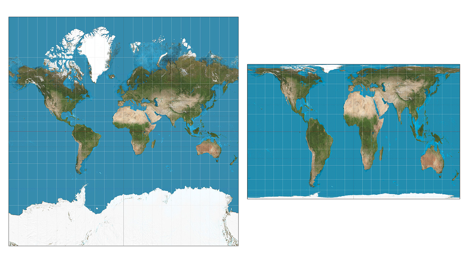
Presented at the same scale, it is clear how the Mercator map projection (l) distorts size while the Gall-Peters projection (r) distorts shape. Sources: Strebe/Wikimedia Commons and Strebe/Wikimedia Commons. Some rights reserved.
Among statistical maps “[the Mercator] is one of the worst map projections you could possibly choose,” said Kenneth Field, a senior engineer at mapping software firm Esri and author of the blog Cartography. “The huge distortions in sizes of places across the map that propagates and gives the reader a false sense of ‘how much’ when they are trying to interpret the map.”
That said, some maps are wielded to serve a specific purpose, to present a view of the world which benefits those that share it. That is the main criticism of the Mercator projection of the earth: it may be mathematically accurate but it makes Europe and North America look bigger, and therefore more important, than regions like South America or Africa.
Other examples are more recent.
In 2019, US President Donald Trump tweeted a map of the States emblazoned with the words “Try to impeach this”. The image, appearing to show the country filled coast-to-coast with Republican red, inaccurately displayed what looked like a vast landmass won by Trump in comparison to blue counties won by Hillary Clinton. A similar map was hung on the White House walls to show the results of the 2016 electoral college results.
But the map does not show population density, which results in a huge misrepresentation of scale as it hasn’t distinguished between counties with millions of residents and counties with a few thousand. People who didn’t vote are not shown either, leaving millions unrepresented.
Kenneth Field presented an example of how different the map would look if it showed where people live and where they voted on a more granular and accurate level.
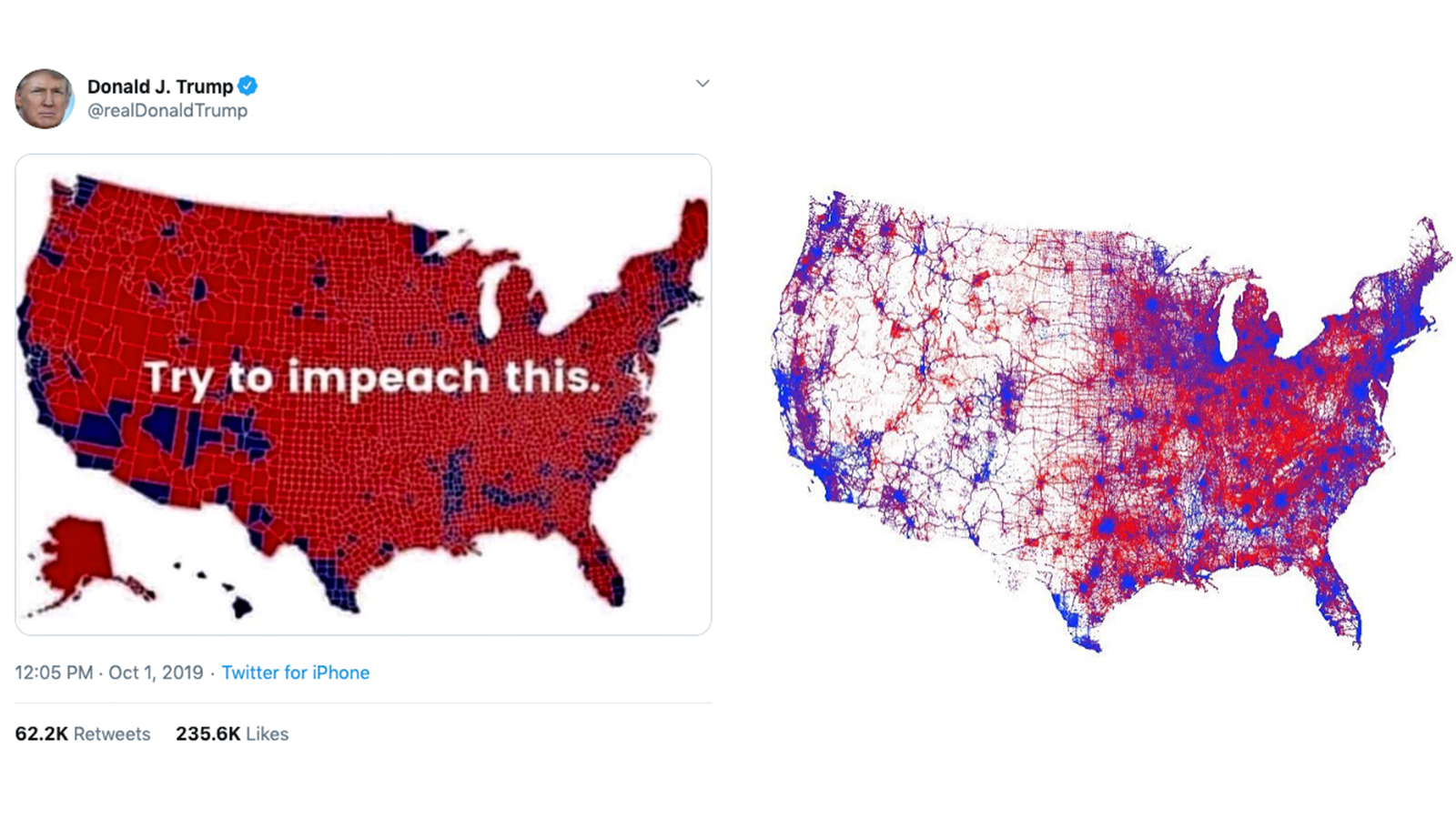
The choropleth map tweeted by Donald Trump (l) did not show population density like Kenneth Field’s map (r). Screenshots by author.
Numerous other examples have recently filled social media feeds all over the world to visualise the spread of the coronavirus in China and further afield.
As well as the inherent problems of colouring large and diverse regions in one, homogenous colour, the choropleth maps created by news organisations like the BBC or Canadian broadcaster Global News, for example, show total figures, instead of being normalised for population by showing cases per capita.
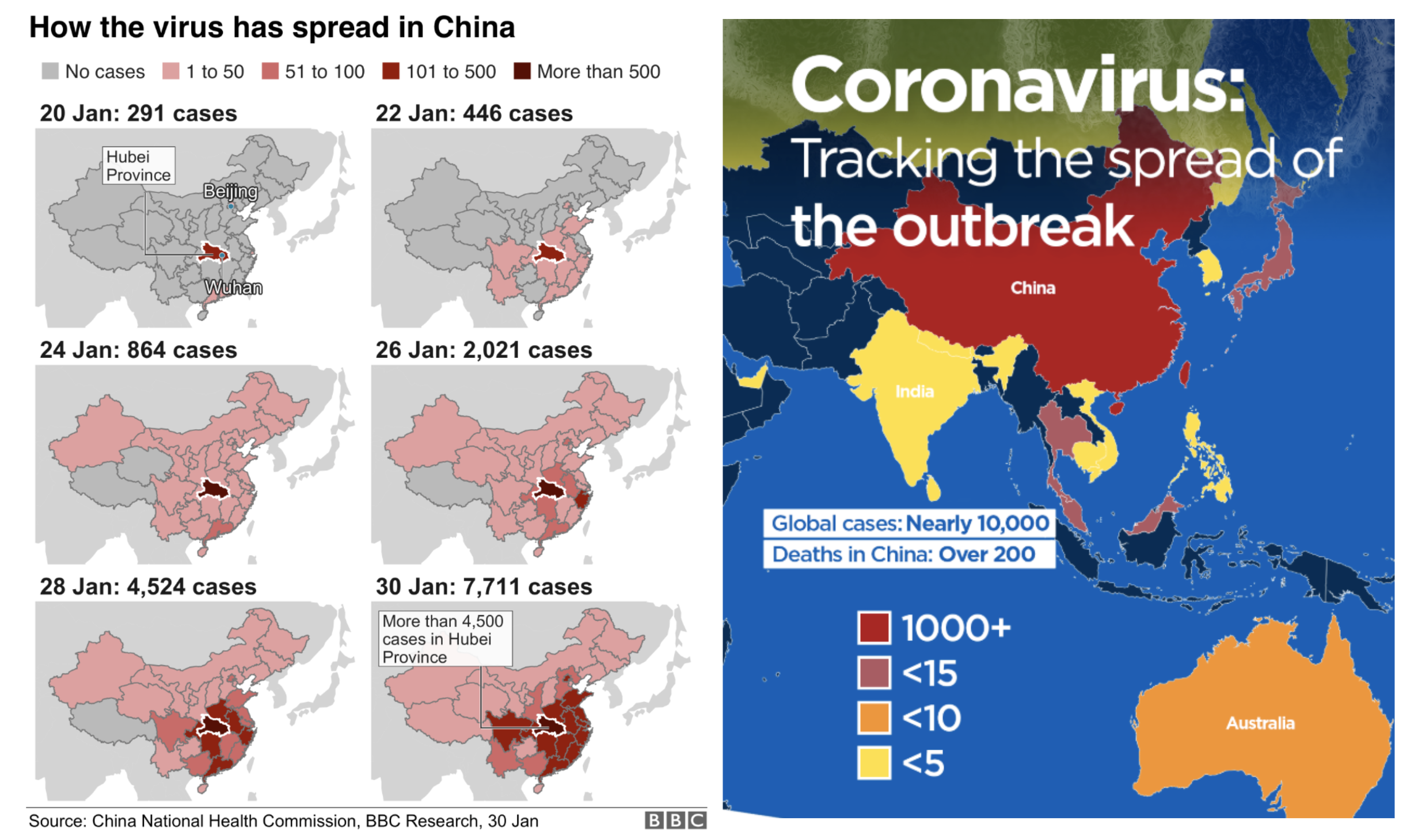
Even when well meaning, these maps by the BBC (l) and Canadian broadcaster Global News (r) distort the nature of coronavirus. Screenshots by author.
“There’s a tacit assumption on the part of the reader that a map is telling them some objective facts,” Field said.
“But not all maps are created equally and these sort of quick media maps are often some of the biggest culprits.”
None of these are outright misleading but neither do they present a wholly accurate picture of what is happening on the ground.
The MyFireWatch map, an initiative of the Western Australian government, had the perfect combination of poor design and widespread misinterpretation when shared online.
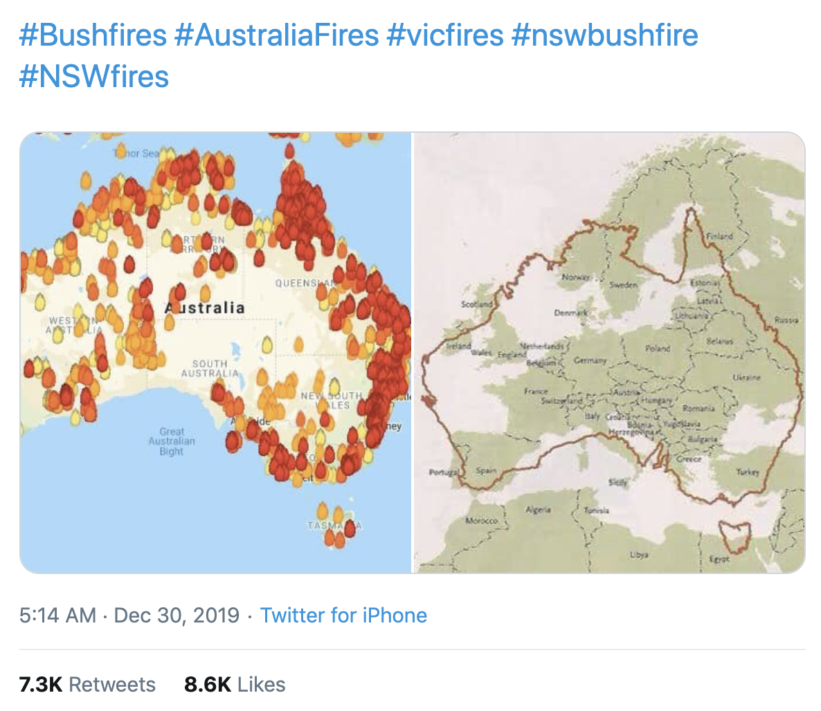
This image of the MyFireWatch map — which shows heat sources, but not necessarily fires — was shared in a viral tweet with the caption “Here is a map of all the fires burning in Australia. Here also is a map of Australia overlaid on Europe.”. First Draft cropped the caption to avoid amplifying the false claim. Screenshot by author.
The design of the map had a number of issues.
Rather than wildfires, the flame icons represent sources of heat on the Australian landmass that are above a certain temperature — from patches of desert to natural gas refineries — detected over the course of 72 hours. BuzzFeed News noted 34 “persistent hotspots” on MyFireWatch that were not fires.
Additionally, the heat sources were colour-coded based on time rather than the severity of fires. Here, a deep red represented a source of heat detected in the last 12 hours, while on other public information systems the red flame icon symbolises an emergency warning.
“It’s sensationalist in its use of the flame symbols that imply a much larger area is burning than is true,” Kenneth Field told First Draft.
“It’s just not necessary to make huge flame symbols that imply a disaster way more than reality,” he said. “The reality is bad enough as it is without a map going over the top.”
The well-meaning interactive service carries a disclaimer that “the information is not to be used for the preservation of life or property”, but it was misrepresented by thousands of social media users. The map creators have since changed the symbols from flames to sun shapes.
“There is some work to be done, not only by the designers but also by the readers,” said Mr Cairo.
Everyone needs to share the responsibility to avoid making disinformation go viral, especially with controversial and problematic issues which are at the centre of many news stories.
“For me the crucial issue is not media or graphic literacy. There is something that presides over all of these which is, attention and knowledge.”
“We live in a culture that doesn’t always reward attention, but we can curve and fight against that. Becoming more attentive and careful, not retweeting things mindlessly and becoming a little bit more aware of our biases and how easy it is to become prey,” concluded Mr Cairo.
Anne Kruger also contributed to this report.
Stay up to date with First Draft’s work by subscribing to our newsletter and follow us on Facebook and Twitter.

