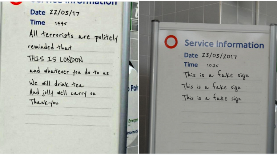
Following the London Westminster terrorist attack in March of this year, an image representing the strength and solidarity of Londoners emerged on Twitter. It’s not uncommon for workers on the London Underground to write messages of national unity on tube signs following tragic events, and the March terrorist attack seemed no different. The image proceeded to spread like wildfire, with TV personalities, members of parliament, and the media quick to tweet out a photograph of a tube station sign displaying a ‘very British response to the attack’. Within a couple of hours, these tweets had been shared thousands of times. By noon, a member of Parliament had read out the sign, which Prime Minister Theresa May called a “wonderful tribute”.
The problem, however, is that the sign never existed. It was a fabricated image, created using an online image generator.
This wasn’t the only piece of misinformation shared during and immediately after the terrorist attack. However, the majority had one thing in common: a visual element. Rarely were stories shared exclusively in text form; they were often visuals accompanying a piece of text. (Buzzfeed produced a helpful catalogue of all the fabricated and misleading stories distributed online.)
Visuals are regularly being used as persuasive vehicles for mis- and dis-information. And photographs are not the only kind of visuals to consider. Graphs and charts—with their uniform, scientific format—are increasingly used as agents for misinformation, as they can give a false sense of authority.
These trends are concerning. Recent research has demonstrated that people are very poor at identifying manipulated images. And while the technology companies have vowed to combat the sharing of mis- and dis-information, their efforts have focused solely on text, which is much easier to discover and interpret.
Visual misinformation might differ from text-based information in important ways. What cognitive processes in our brains might make visual information seem more believable? Does the type of imagery used affect the likelihood that a piece of information is false? What kinds of deception are supported by visual information?
These are the types of questions we are attempting to answer as we build our typology of visual misinformation. To do so, we are using the data from the CrossCheck French election project and First Draft’s UK election project, which tracked and fact-checked the highly shared, misleading ‘content’ during these two elections. By creating a typology that identifies the types of misleading visuals spread during these elections—as well as the different types of deception used—we hope to help people understand how visual information is used as a tool of deceit, and in turn combat the spread of misinformation online.
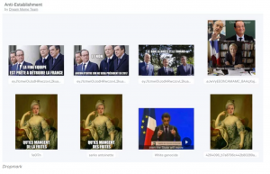
One focus of our research is memes, which have become a particularly important stand-alone method of disseminating misinformation. Gone are the days of LOLcats. Memes are now used as a powerful information-sharing tool and are evolving into a phenomenon with no fixed definition. Whereas 10 years ago, image macros (or meme shells) were used to create funny captions, they are now used as tools of political maliciousness. This analysis by Ryan Broderick from Buzzfeed during the French election highlighted how US teenagers attempted to influence the French Twittersphere using anti-Macron memes.
In an interview from a few years ago, Richard Dawkins argued that his original 1976 definition of meme still fits. It’s something that spreads, like a virus. But is this loose definition enough? Is a more concrete one required?
Leading scholars within meme research, such as Limor Shifman, have offered various definitions in recent years, aiming to address the different ways and modes through which memes become part of popular culture. The most recent meme definition was offered by Ryan Milner in ‘The World Made Meme’, and repeated by An Xiao Mina at a panel on memes and journalism at the International Journalism Festival earlier this year: ‘Internet memes are digital objects that are shared and remixed by multiple people’. But is this an appropriate and useful description for a phenomenon that is unpredictable and ever-changing?
Memes are frustratingly fluid in their definition, but they are now critical to understanding the current information ecosystem. While the term is often used to describe visuals with the aesthetic pictured above, we desperately need a more sophisticated typology to explain different visual techniques to mislead. We also need to pay close attention to the element of ‘memes’ that is so frequently forgotten in this discussion around information pollution: the fact that memes, crucially, are socially constructed. It is this social aspect—memes’ role as a representation of the collective social conscious—that solidifies their importance in this debate.
We hope our research will provide a much-needed framework for the way people talk about visuals, particularly as they apply to mis- and dis-information.
This research is a collaboration between First Draft News and The Visual Social Media Lab.