Network analysis has become an important tool for a disinformation expert. An increasing number of journalists and researchers are using the practice to analyze the social web and gain insight into the hidden networks and communities that drive information — and disinformation — online.
Take, for instance, open-source intelligence expert Benjamin Strick’s Bolivian Info Op Case Study for Bellingcat, or his uncovering of a pro-Chinese government information operation on Twitter and Facebook. Thanks to the analysis of these networks, the author was able to disclose coordination and manipulation, and to shed light on some of the most common tactics behind a disinformation campaign.
Online connections can influence how political opinions take shape, so analyzing these networks has become fundamental.
But there are challenges. Not all datasets identify relationships and it’s up to the journalist or researcher to define these connections. Sometimes you might end up with a visualization that, despite its beauty or complex nature, reveals nothing of interest about your data.
Although they might seem to be impressive visual content to share with your audience, network visualizations are first and foremost great tools for exploration. They are by no means conclusive charts.
And even though it’s an increasingly common tool in the field, network analysis is a detailed process that challenges attempts to penetrate it by the world’s top academics, and its application requires caution.
A little graph theory
But first of all, how do you define a network? In graph theory, a network is a complex system of actors (nodes) interconnected by some sort of relationship (edges).
A relationship could mean different things — especially on social media, which are fundamentally made of connections. Network analysis means focusing on understanding the connections rather than the actors.
One of the first examples of online networks was the ‘Bacon number.’ The idea emerged in 1994 when the actor Kevin Bacon said in an interview that he had worked with “everyone in Hollywood.” Since then, Google can calculate Bacon numbers for any actor in the world and show the connections to the first node. Actors who have worked directly with Kevin Bacon have a Bacon 1, and so on.
On Facebook, networks take shape based on friendships, Pages, and groups in common.
On Twitter, however, you can also investigate things like hashtags, retweets, mentions, or quotes as well as whether users follow each other.
For example, two accounts on Twitter are the nodes of a network. One retweets the other, and this is called the edge. If they retweet each other multiple times, the weight of their relationship will be higher.
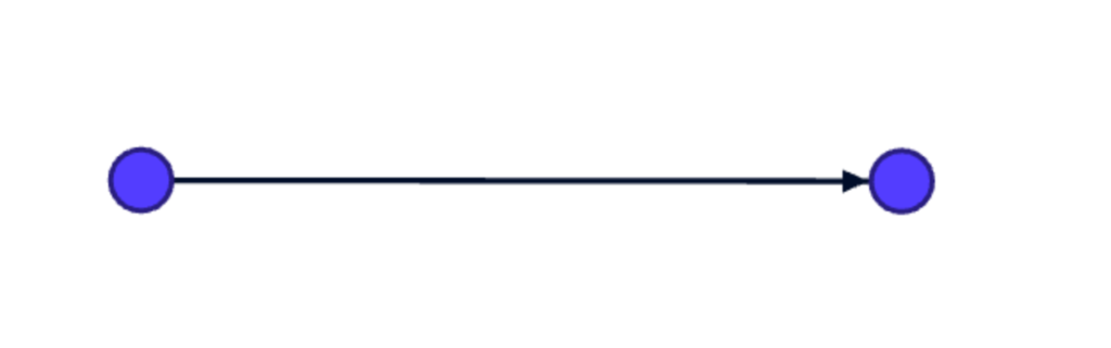
In this example, one account (first node) retweets (edge) another account (second node). Screenshot by author.
The weight of a relationship is only one of the attributes of nodes and edges.
Another important attribute is the degree (or connectivity) of a node, which describes the number of connections.
A fourth is called the direction, which helps us understand the nature of a relationship. When an account retweets another, it creates what is called a directed connection. In directional networks, there are in-degree values, for when an account retweets or mentions another, and out-degree values, when an account is retweeted or mentioned by another. But other times connections don’t have directions, such as two friends on Facebook, for example.
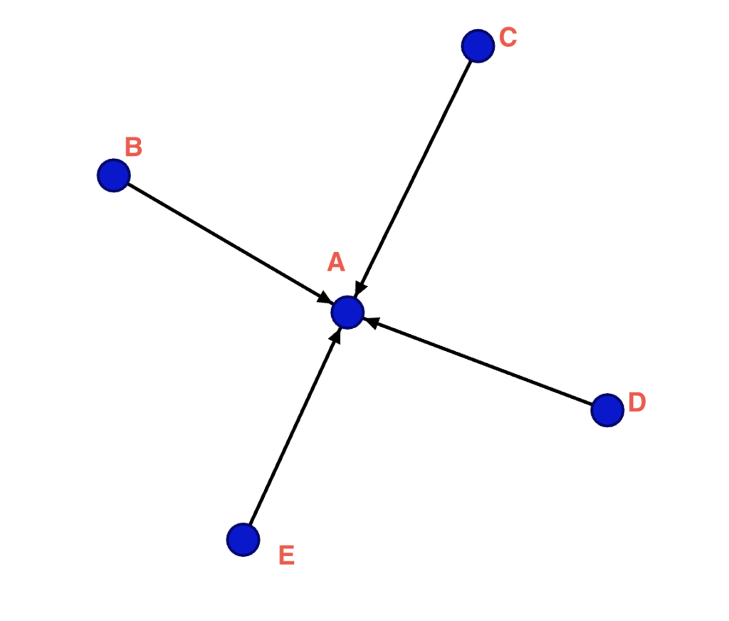
The in-degree shows the inwards connections, where B, C, D and E are the sources, and A is the target (A was tagged by B). Screenshot by author.
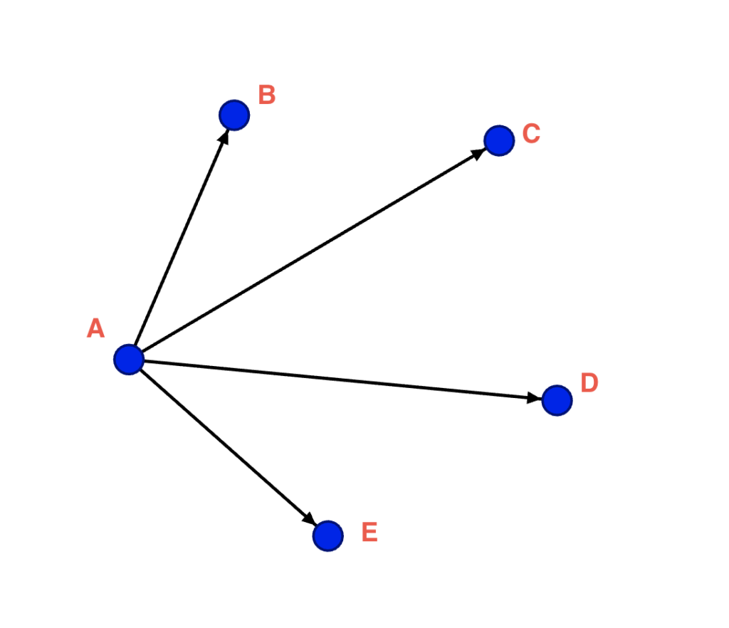
In the out-degree, A is the source and B, C, D and E are the targets (A tagged B, etc). Screenshot by author.
The density shows how well-connected the graph is, dividing the number of connections the nodes have by the total possible connections a node could have. The closeness is the position of a node within the network (or how close it is to all other nodes in the network); a high value might indicate an actor holds authority over several clusters in the network.
The position of the nodes is calculated by complex graph layout algorithms that allow you to immediately see the structure within the network.
The benefit of network visualizations is to look at a system as whole, not only at a part of it. The challenge is to identify what kinds of relationships you want to investigate, and to interpret what they mean.
Tools for analyzing and visualizing networks
Several tools are available for sketching and analyzing the networks that you produce in the course of your investigations, and some allow you to gather the necessary data directly.
Here are some of the best free tools:
Neo4j is a powerful graph database management technology, well-known for being used by the International Consortium of Investigative Journalists (ICIJ) for investigations such as the Panama Papers.
Gephi is an open-code program that allows you to visualize and consult graphs. It doesn’t require any programming knowledge. It is stronger for visualizations than for analysis, but it can handle relatively large datasets (the actual size will always depend on your infrastructure).
If you are familiar with coding, you might want to explore Python’s network analysis library NetworkX, or R’s igraph package. Sigma is a great library dedicated to graph drawing if you are comfortable with JavaScript.
The trick about visualization in general is to find the clearest way to communicate the data.
Prepare your data
First you will need data to analyze, of course, and you can obtain network data in several ways.
The easiest way is to download the Twitter Streaming Importer plug-in directly on Gephi. It connects to the Twitter API and streams live data in a Gephi-friendly format based on words, users, or location, allowing you to navigate and visualize the network in real time.
But if you want to use Twitter historical data, you need to use some scrapers — read our tutorial on how to collect Twitter using Python’s tweepy — and convert the scraped data into a format-friendly file for network visualizations using the tool Table 2 Net.
The tricky part can be identifying which column in the data is for nodes and which is for edges. Not all datasets include connections, and you need to make sure the columns selected contain mentions, hashtags, and accounts, in a clean, tidy format.
Once you have selected the columns to create your network, you can download the network file as .GEXF, the Gephi file format.
Alternatively, you can use the programming language Groovy to generate a GEXF network graph from a JSON file in your terminal. You can choose from among mentions, retweets, and replies. Type on your terminal the following command: groovy export.groovy [options] <input files> <output file>
Explore a bit of Gephi
In this example, let’s use a sample that collects mentions of Bill Gates on Twitter, as he has been a constant subject of misinformation and conspiracy theories throughout the pandemic.
Once you upload the GEXF file on Gephi, this is how the network will look:
Network data loaded into Gephi at first glance. Screenshot by author.
You have to play around with filters, parameters, and layouts to visually explore your network and turn this amorphous mass of dots into a meaningful shape.
The program will also give some initial information about the network. In the @BillGates file, for example, there are 19,036 nodes (individual accounts) and 207,780 edges (connections between accounts) — a fairly high number of edges.
Let’s have a quick overview of the menu options in the software at the top:
- Overview is where you work on the network’s functionalities;
- Data Laboratory is a display of your dataset in a table format;
- Preview is where you can customize your final network visualization.
Here are a few quick actions to start investigating the network:
What is the average degree of connections?
The average degree will show the average number of connections between the nodes. Run ‘Average degree’ under Statistics on the right-hand side to receive a ‘Degree Report’ of the network.
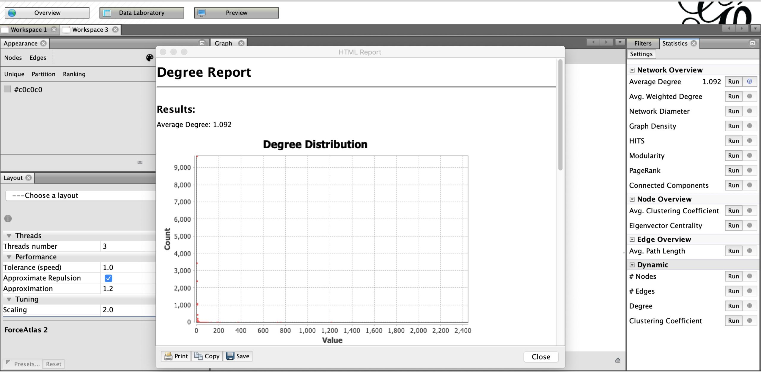
Run ‘Average degree’ under Statistics to receive a ‘Degree Report’ of the network. Screenshot by author.
The average number of connections between the accounts that mentioned @BillGates is 1.092. In other words, an account has, on average, mentioned one other account in this sample.
Which are the main nodes in the network?
You now want to discover which nodes have the highest number of connections. These could be either direct or undirected connections. For example, it could be interesting to see which Twitter accounts a divisive handle retweets the most, or the top accounts that mention a divisive account.
Change the size of the nodes in Gephi by clicking on ‘Ranking’ on the left and by choosing ‘Degree’ as an attribute. Set the minimum and maximum sizes, and the nodes’ dimensions will change according to their number of connections.
In the Bill Gates example, we are interested in knowing which accounts tag him the most (inward connections). To do that, choose the ‘out-degree’ attribute, which will increase the dimensions of the accounts that mentioned Gates the most.
To improve the network’s visibility, choose the layout Force Atlas 2, which uses an algorithm to expand the network and better visualize the communities that are taking shape, as shown below.

Change the size of the nodes in Gephi by clicking on ‘Ranking’ on the left. Screenshot by author.
Are the actors connected to different communities?
The ‘modularity’ algorithm is often used to detect the number of clusters, or communities, within a network, by grouping the nodes that are more densely connected.
Hit the Run button next to Modularity under the Statistics panel. Doing so will yield a modularity report, which often has quite interesting details for analysis.
At this point, use the partition coloring panel to color the nodes based on modularity class and apply a palette of colors to them.

Use the partition coloring panel to color the nodes based on modularity class and apply a palette of colors to them. Screenshot by author.
The next step is to learn something from the graph you have created. By right-clicking on a node, you can see its position in the Data Laboratory, along with the newly created columns displaying degrees and modularity value. While the visualisation helps looking at the global picture, here you can manually explore the data.
You can also apply text to the graph and visualize the names of the nodes.
In the preview tab, you can choose different options to visualize the network. You can add labels, change the background color, or play with sizes of nodes and edges.
If the graph is too crowded, use filters to show fewer nodes. For example, you can filter by number of in-degree or out-degree connections, depending on what you are interested in highlighting.
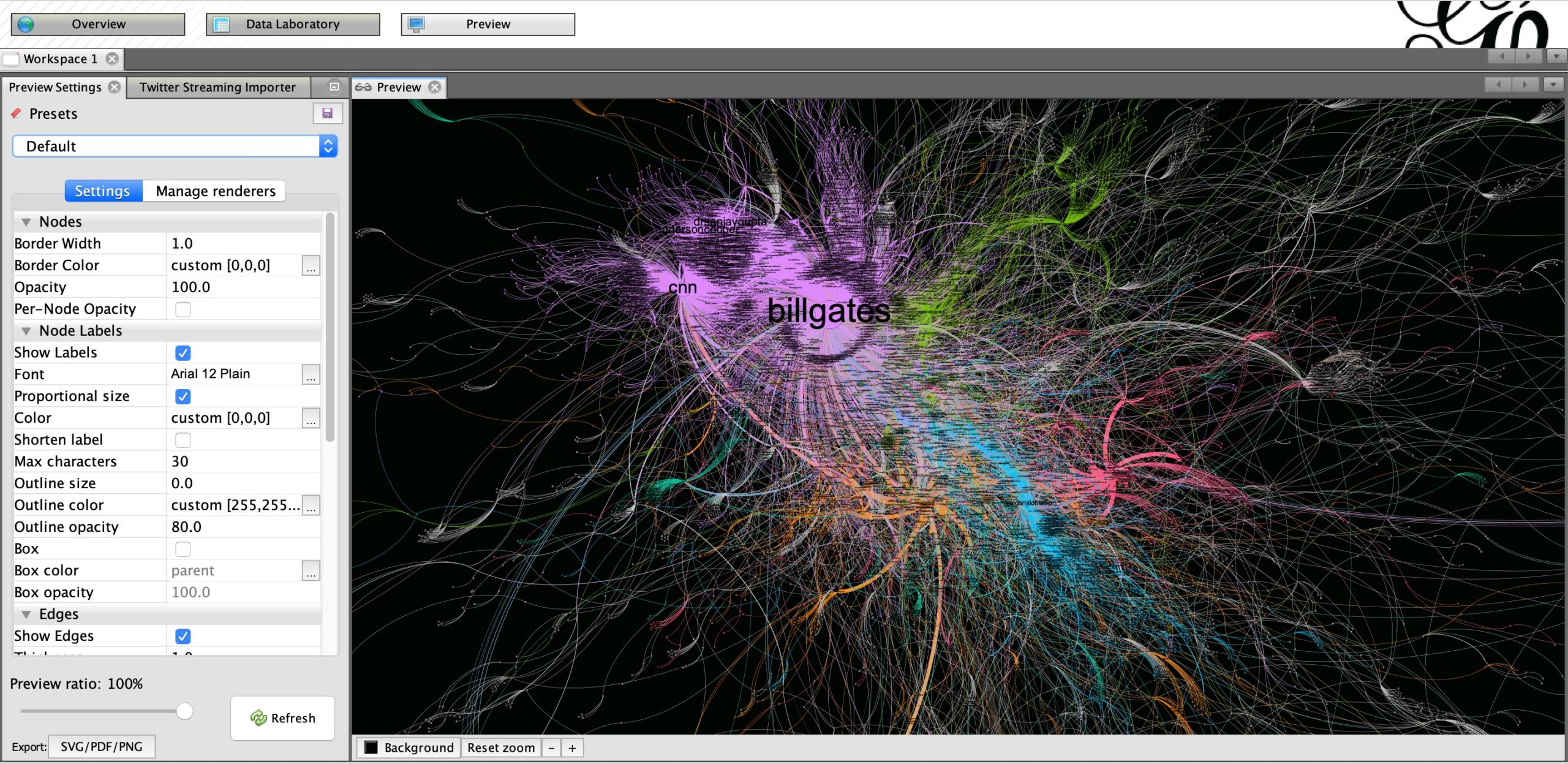
In the preview tab, you can choose different options to visualize the network. Screenshot by author.
Remember that data visualizations are a great way to make complicated topics more accessible and engaging, but they can be misleading if they are not well-designed and easy to understand.
Make sure your network graph is visualizing exactly what you are trying to express. Add clear annotation layers to aid in reading it. And don’t try to use them at all costs. Sometimes a simpler chart that conveys its meaning more effectively might be worth thousands of nodes.
Stay up to date with First Draft’s work by becoming a subscriber and follow us on Facebook and Twitter.