It’s been a very tough couple of months. On an almost daily basis, news broke of yet another tragic event and most early reports featured some form of graphic video shot by a bystander or someone involved. As is so often the case, we didn’t have to wait for a camera crew to arrive to see what was happening. Graphic images immediately flooded our social streams because eyewitnesses, unlike trained media professionals, don’t self-edit – they just hit record and publish raw footage.
In the last few months, as a general consumer of news, I unexpectedly saw a Snapchat video captured by Amanda Alvear, one of the victims of the Orlando club shooting. I saw her face as she heard the first gunshots in the club. I also saw footage captured by someone inside one of the bathroom stalls as they feared the gunman would return. I saw the immediate aftermath of the Nice truck attack with victims sprawled along the road, and graphic video from the Bosphorus Bridge in Turkey when a soldier was beheaded after the failed coup.
And I saw Philando Castile die.
The Facebook Live video, broadcast by Diamond ‘Lavish’ Reynolds immediately after her boyfriend Philando Castile was shot by a police officer, has been viewed 5.7 million times to date. There have been many think pieces about this event, how livestreaming video could change the face of justice, how Facebook Live has become our new global distress signal, the potential traumatic impact of seeing images as powerful as these in real-time and the consequences for the social networks as live video gains po
pularity. 
I’m wary of writing a piece about the technological aspect of this story as Philando Castile’s death highlights so many other social issues in America today. However, Reynold’s calm and dignified use of Facebook Live, and the resulting mainstream news coverage, will undoubtedly encourage more people to use the new feature when they find themselves in similar situations.
And crucially, this video shows the ‘moment of death’. News editors have always faced tough decisions around this type of footage, and while broadcasting someone’s death used to be a rarity, it is undoubtedly becoming more common.
I therefore wanted to examine how the video was used by mainstream news, by analysing the coverage from 23 major news organisations on July 7 and 8 2016, the two days following Castile’s death. I studied all web stories and posts published on the official Facebook, Twitter and Instagram accounts on these days.
The sample news outlets published 229 original stories or social media posts that featured the video in some way during that period: 141 web stories (6.1 stories per outlet on average) and 88 social media posts (3.8 posts per outlet on average).
Here are some of the key findings. You can read more detailed analysis at the end of the piece.
- Of the 229 stories and social media posts, 45 per cent used just a screenshot from the video.
- The most frequently used screenshot was the police officer’s gun pointing through the car window. It should be noted that a graphic still image of Castile with his head slumped, eyes half-closed and his t-shirt soaked with blood was used a number of times by a small number of outlets (New York Times, New York Daily News, Fox News).
- The remaining 55 per cent used the video footage:
- 18 stories or posts used the whole nine-minute video, 107 stories and posts used clips from the video
- Seven of the 23 outlets embedded the official Facebook Live video, some multiple times. Two news sites used scraped versions of the video uploaded illegally by others to YouTube.
- There was no consistent standard in terms of blurring out the imagery. Some outlets blurred out the bloody t-shirt but not Castile’s face. Some blurred out his face but not his bloody t-shirt. Some blurred out Castile altogether.
- Thirty-seven per cent of the 175 stories and posts that included graphic content did not include any form of warning or blurred imagery.
- Forty per cent of the same were accompanied by a warning. Of those, 73 per cent displayed a full screen warning
- Twenty-three per cent did not have a warning but blurred the content in some way
- Nineteen of the 126 videos had autoplay functionality turned on. Five did not have any form of warning, but graphic content in the subsequent video was blurred.
The research findings show the video in question was widely reported and its potential impact on viewers in terms of graphic imagery was generally acknowledged and handled responsibly. Frequent, large warnings about the distressing content appeared before the footage played or was layered onto the opening visual and no videos autoplayed without a warning. Graphic imagery was mostly blurred or obscured.
But what this content analysis can not capture is the impact of the haunting words of Diamond Reynolds, the moans from Philando Castile, the slow recognition that you’ve watched a man slip into unconsciousness and die, the realisation that this was playing out in front of a four-year old girl sitting in the back seat of the car, and the knowledge that a woman was able to calmly livestream all of this during the most desperate of personal tragedies.
It also doesn’t account for the fact that Castile’s death happened within 24 hours of the shooting of Alton Sterling. The country was still reeling from the two graphic videos that emerged from Baton Rouge, prompting outrage and disbelief that little appears to have changed since the death of Michael Brown in Ferguson, Missouri two years ago.
For many communities, videos such as these provoke genuine fear. Blurring out a bloody t-shirt doesn’t dampen the psychological impact of these elements of the video. While we can draw on existing policies for graphic imagery that have been developed over years in newsrooms, the visceral nature of live video and the fact that you’re watching events play out in real-time has yet to be researched adequately.
Should newsrooms have used the video?
Previously, an editor could make a call that pictures coming in from the agencies or from their own staff were too graphic, and they would end up on the cutting room floor. Now the intent and the experience of the eyewitness can become part of the story.
CNN ran with the footage very soon after the shooting had taken place, and the presenter introduced the video with the words:
“We must warn you the video is very graphic and may be very upsetting but we’re showing the video to you because the woman who shot it clearly wanted people to see what happened.”
The explanation given by CNN raises some key questions in the discussions taking place in newsrooms today. Should news organisations amplify this type of footage? Should they reflect what audiences are seeing in their social feeds? Or should news organisations simply report that a graphic video exists, because audiences can seek out the raw video themselves on social media?
Many newsrooms have very strict guidelines around the moment of death, but the emergence of graphic eyewitness media in breaking news events is clearly pushing boundaries. That some newsrooms blurred out Castile’s t-shirt while others concealed his identity highlights the multiple considerations producers face when including a video like this in news coverage.
The numbers and examples in this research are meant to encourage conversations inside newsrooms about how to cover live video in the future, particularly graphic streams.
From studying this case, it might appear that there are generally consistent standards emerging around the use of live streams by mainstream media. However, by the time most news organizations had been alerted to this video Reynolds had stopped filming.
Greater challenges emerge when an ongoing event appears on a live stream. Over the next few months, I hope we see more conversations between the news industry and the social networks themselves about how best to handle this type of footage.
Additional Research Findings
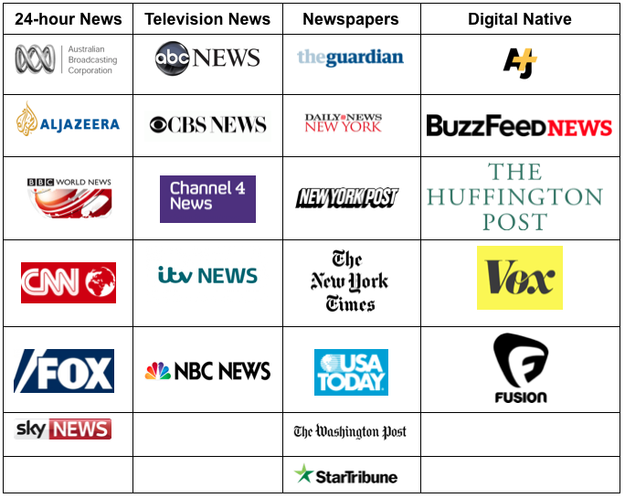
My sample included six 24-hour news channels, five television news outlets, seven newspapers (including local Minnesota newspaper, the Star Tribune) and five digitally native news websites.
Research Question 1: How many newsrooms used the video and where?
During the three-day time period, the sample news outlets published 229 original stories or social media posts that featured Diamond Reynold’s video in some way. On average, ten stories or social media posts were produced by each outlet.
The New York Daily News posted the most (25 items) and Channel 4 News and Fusion the least (three items). Remember the study analysed stories that included footage or screenshots from the video. An outlet like Fusion for example covered the story quite extensively, they just didn’t include the imagery as frequently.
There were 141 web stories (6 stories per outlet on average) and 88 social media posts (3.8 posts per outlet on average). Twitter was the most popular distribution network (48), followed by Facebook (37). There were only three posts by the sampled outlets posted to Instagram.
Research Question 2: How was the video used?
Of the 229 stories and social media posts, 45 per cent used a screenshot from the video. A total of 126 stories or posts included the video footage in some form, with 30 per cent featuring just the raw video (some included the full nine minutes, while others selected clips) and 70 per cent using parts of the video in a package with other footage.
As the table below shows, web stories were more likely to include some form of video, whereas social media posts were more likely to use screenshots. It would be interesting to know if this was deliberate because of previous calls to think carefully about videos autoplaying on social media.
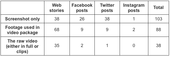
How did news organisations use Lavish Reynold’s video of the shooting of Philando Castile? Source: First Draft
Research Question 3: Who used the raw video?
Some 38 web stories or social media posts featured the raw video, without any other footage. The whole video was used in 18 stories or posts by nine outlets. Seven outlets embedded the official Facebook Live video (Huffington Post, New York Daily News, New York Times, USA Today, Vox, Washington Post). AJ+ embedded the whole video in the comments of a Facebook post they shared on the story.
The New York Post scraped the whole nine-minute video and presented it in their own player. The Minnesota Star Tribune and one story on the Huffington Post embedded a copy of the video which another user had posted on YouTube.
ABC Australia, BBC World, The Guardian and NBC all scraped parts of the raw video and uploaded it to their own players. It is important to note that this process allowed them to blur graphic parts of the video.
Research Question 4: How were graphic warnings used?
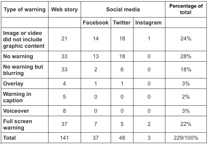
How did news organisations signal the graphic imagery in Lavish Reynold’s video of the shooting of philando Castile? Source: First Draft
One notable example of a graphic warning came from the Minnesota Star Tribune, which offered readers the chance to read the transcript of the video if they didn’t want to watch it.
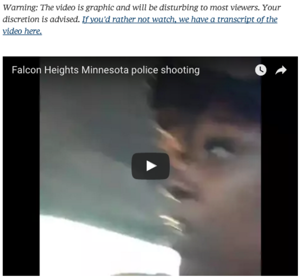
Screenshot from The Minnesota Star Tribune’s coverage of the video
Here are two other examples of full screen graphic warnings:
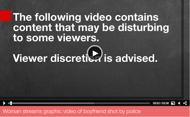
Screenshot of how CNN displayed a graphic imagery warning in at the start of the video on their website
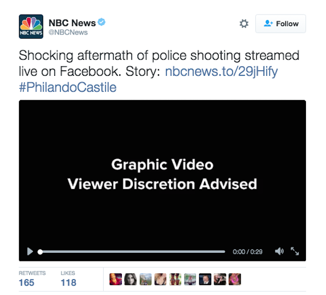
Screenshot of a NBC tweet with a warning before a clip of the video
Other outlets used overlays. Here are two examples:
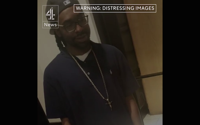
Channel 4 featured a warning directly before a clip from the Lavish Reynold’s video in this video package published to Facebook
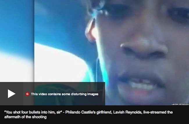
The BBC displayed a lower-third warning about the graphic nature of the video on its website
Some outlets did not have a graphic warning but blurred out portions of the video. In the below example from Good Morning America, the lower third caption concealed graphic imagery.
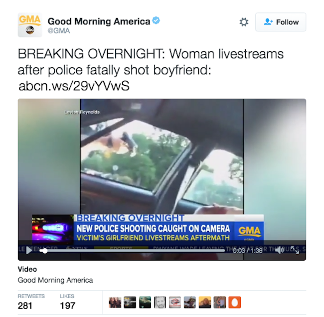
The lower-third chyron obscured most of the graphic imagery in this tweet from Good Morning America
Research Question 5: How frequent was autoplay?
Of the 126 videos included in the sample, 19 (15 per cent) had autoplay functionality turned on (five web stories, eight tweets and six Facebook posts). Five did not have any form of warning, but graphic content in the subsequent video was blurred.
The vast majority of videos on the websites had pre-roll ads, so even if autoplay was turned on, the viewer had to sit through a 15- to 30-second video beforehand. My observation of the use of pre-roll ads before graphic videos during this study has underlined the need for additional research in this area.
A note on sampling
When putting together this sample, I wanted to include twenty-four hour news channels, traditional news outlets, print publishers and digital native sites. I also wanted to include the local newspaper the Minnesota Star Tribune to see whether geographic distance from the events impacted the coverage.
Finally I wanted to include some international outlets to understand whether patterns were different in other countries. No sample is perfect, but these 23 outlets do provide a range of different types of news organisations.
The stories and posts were identified in the following way. For each outlet, we ran a Google site search, (e.g. [site:washingtonpost.com Castile] between the dates July 6-8). All results were viewed and only those that included imagery from the video were included.
For Facebook, Twitter and Instagram, we manually scrolled through feeds for the dates of the sample.
Additional research support by Jack Sargent.


